Fund reports
Financial reporting and dynamic graphics
Getting started
First, download and unpack the tutorial pack.
Copy this to the directory you wish to use for the project.
As this is a ReportLab tutorial, it should come as no surprise that you will need to download and install our software. You will need to sign in or register on our site; then, follow the installation instructions to get yourself set up.
This tutorial is designed to run on ReportLab 3.0+ and Django 2.2.
To check that all the dependencies are in place, start Python up (inside your virtual environment, if you are using one) and check these imports all work:
Python 3.8.1 (default, Mar 19 2020, 11:00:34)
[GCC 6.3.0 20170516] on linux
Type "help", "copyright", "credits" or "license" for more information.
(InteractiveConsole)
>>> import django
>>> django.VERSION
(2, 2, 10, 'final', 0)
>>> import reportlab
>>> import PIL._imaging
>>> import pyRXPU
>>> import rlextra
Setting up the database The database is based on SQLite3, and by running the Django syncdb command inside the /project/ directory, you will create the necessary database file.
%   python manage.py migrate
%   python manage.py loaddata  project/fundreport/fixtures/initial_data.json
Create a superuser account when prompted. This creates an SQLITE database file "project/fundreport.db". Sqlite is built into Python so no separate database engine is needed. It will also load in some records from a fixture, giving you 3 funds and a few numbers and facts to display. We have NOT attempted to create a realistic risk management database; we just want to have some facts in there to display in the report.
Start your local server:
% python manage.py runserver
Then browse to:
http://localhost:8000/admin/ to log into the admin interface and browse the available data.
To see a web view listing the available PDFs, browse here: http://localhost:8000/ and click on any link to generate the corresponding PDF.
To generate PDFs from the command line, use the following command, taking the fund ID as an argument (available funds are 1,2, and 3):
% python manage.py makepdf --fund 1 #(or 2, 3 etc)
We will assume that readers of this tutorial are familiar enough with Django to understand the basic URLs and views implemented in this application. As such, we will focus on key elements of the PDF and show how they are created in the document template (/project/fundreport/rml/fundreport.prep).
PDF Walkthrough
Cover Page Using one of the methods above, create the PDF for fund ID 1:
This cover page is laid out in the template section of the prep file:
<pageTemplate id="cover">
    <pageGraphics>
        <image file="/logo.png" x="520" y="500" width="250" preserveAspectRatio="1"/>

        <setFontSize size="24"/>
        <fill color="BLACK_TEXT"/>
        <drawString x="72" y="420">ReportLab Investment Management</drawString>

        <setFontSize size="18"/>
        <fill color="GRAY_TEXT"/>
        <drawString x="72" y="395">Fund factsheet: {{fund.name}}</drawString>

        <fill color="RL_BLUE"/>
        <rect x="0" y="385" height="3" width="842" stroke="0" fill="1"/>

    </pageGraphics>
    <frame id="1" x1="72" y1="72" width="200" height="200"/>
</pageTemplate>
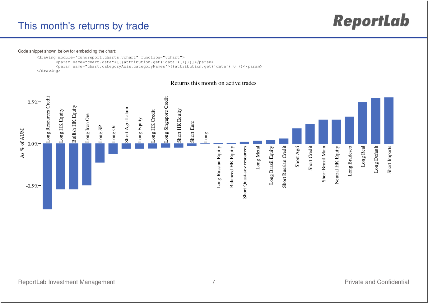
Line chart
The next page shows a basic table and a line chart:
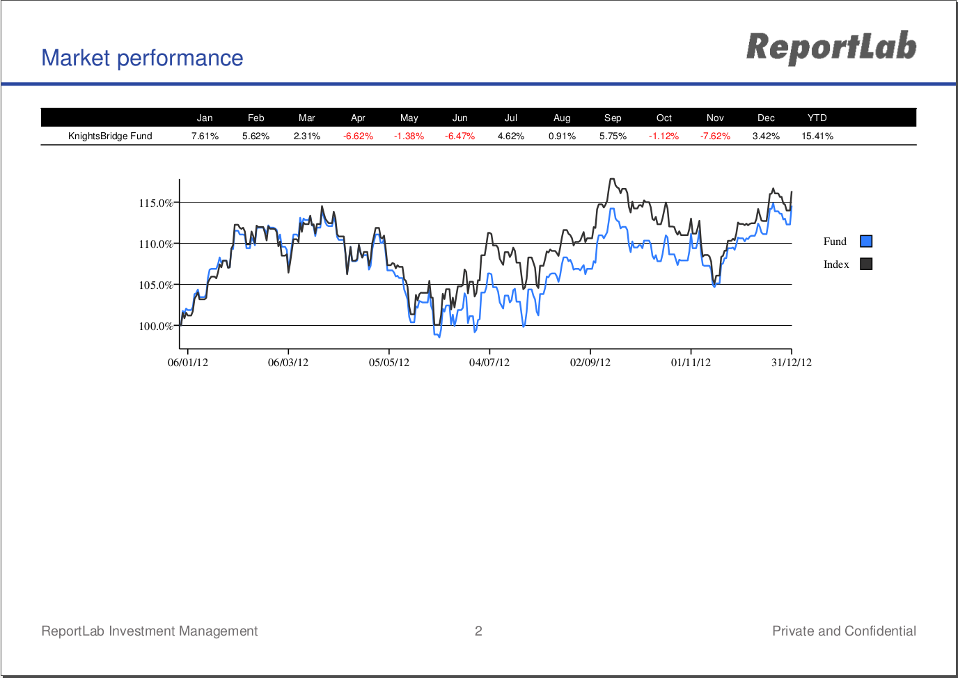
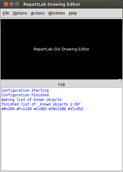
The graphic itself is drawn dynamically using a python module, fundreport.charts.monthperf12mo. This file was created by the ReportLab Drawing Editor, which you can start by calling:
python rlextra/graphics/guiedit/guiedit.py
One running, you can use this editor to open and inspect the chart, monthperf12mo.py:
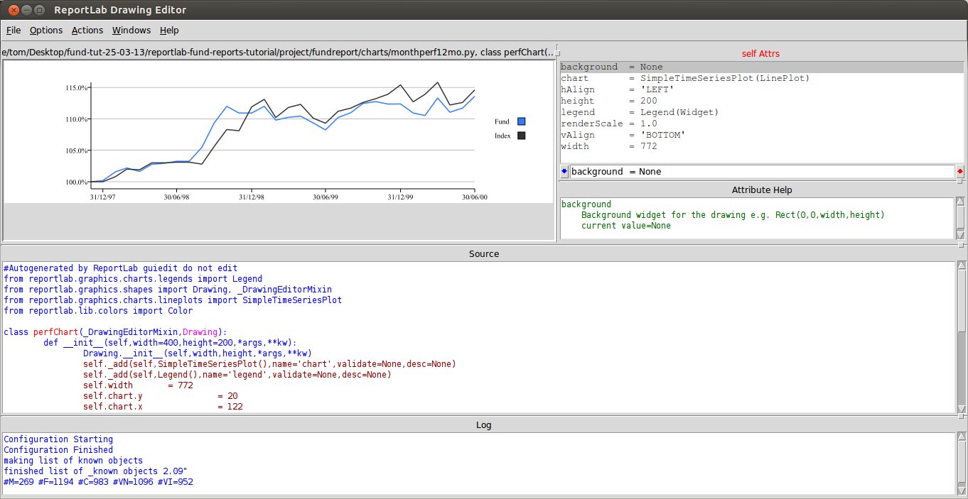
You can adjust the attributes of the chart using this editor, which will save the chart as a python module. This is then accessed within the prep file and used to render a graphic in the PDF. Any variable attributes may be passed in in the prep file:
<drawing module="fundreport.charts.monthperf12mo" function="perfChart">
    <!--pass in dynamic data as a python list expression with preppy -->
    <param name="chart.data">{{line_chart_data}}</param>
</drawing>
The module attribute determines the python file used, the function attribute gives the name of the chart class within that module, and the flexible <param> tag can be used to override any attribute within the chart module by declaring it with the name attribute.
In this example, we are setting chart.data to be line_chart_data, a list of lists we constructed earlier and passed into this template.
Returns Table
The next page shows a complex table lined up next to a chart:
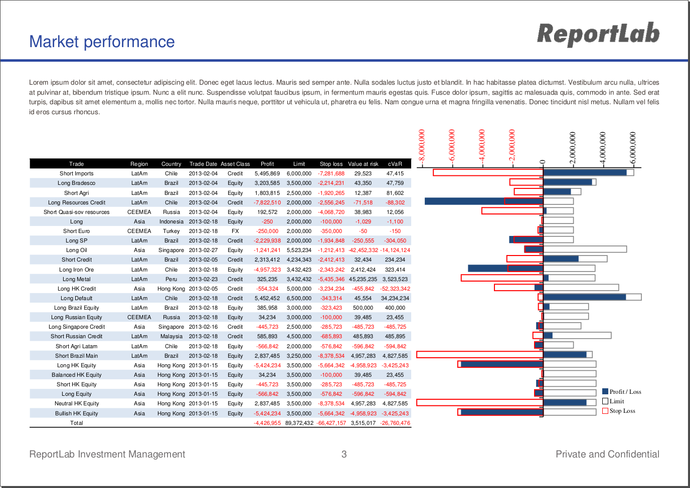
In addition to providing a further example of how to dynamically include graphics into the template, it illustrates a few key techniques.
Get your measurements right ONCE
We cannot stress enough how important planning is when laying out documents. Our tools are specifically designed to give you complete control over the explicit size and position of any element on the page, and you should take advantage of this by deciding up front how the page should look.
In this example, we use a container table with fixed widths to position the inner table and chart, each of which takes up one cell of the container:
<blockTable align="LEFT" vAlign="top" colWidths="479, 293" style="container">
We allocate 293 points of space to the table, and when we create our chart in the drawing editor, as long as we make sure we keep the width set to 293, we can be confident that the chart will always fit perfectly on the page.
Since the height of the chart will vary depending on the number of rows there are in the table, we can dynamically pass in the height attributes when we render the chart in the PDF:
<td>
    <drawing module="fundreport.charts.PortfolioBar" function="PortfolioBar">
        <param name="height">{{drawingHeight}}</param>
        <param name="chart.height">{{chartHeight}}</param>
        <param name="chart.data">{{portfolioBarData}}</param>
        <param name="chart.categoryAxis.reverseDirection">1</param>
    </drawing>
</td>
This way, we can be sure that the bars in the chart will always line up with the appropriate row of the table.
You may be wondering what happens when the table gets too big to fit on one page. Try adding additional data to your database and find out! (HINT: see the
Don't be afraid of Python
We love Python, and if you're interested in Django and ReportLab, there's a good chance you do as well. Our templating tool, preppy, gives you the chance to include python expressions within the document template where necessary. Certainly, most of your Python code belongs in utilities and views within your Django app, but some things just make sense to live in the template. See for example our small script which determines the row heights of the table and the corresponding height of the chart:
{{script}}
portfolioBarData=[[] for i in xrange(3)]
portfolioTotals = 5*[0]
rowHeight = 12
n = len(live_themes)

drawingHeight = rowHeight*(n+1)+barChartPadding
chartHeight = rowHeight*n
{{endscript}}
Also note how we can import functions from a separate module
{{script}}
from fundreport.rml_utils import *
barChartPadding=42
{{endscript}}
negRedTd(), for example is a formatting function for number which can color them depending on value, such as making negative numbers red. Take a look at this function inside fundreport.rml_utils.
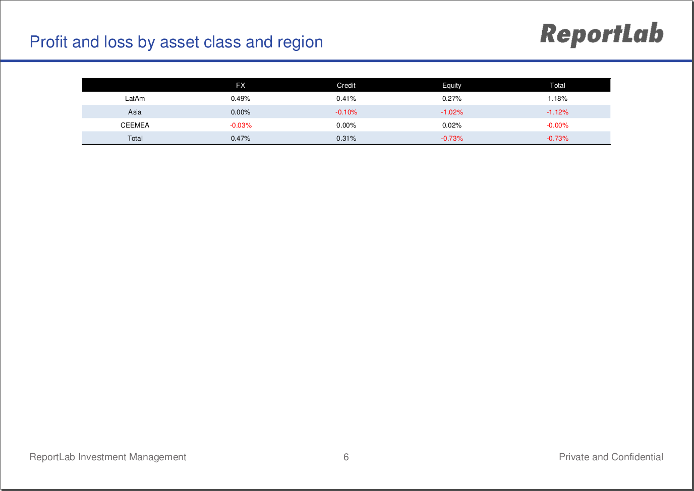
The other tables and charts in the document use very similar techniques:
Back page advert
Finally, it is worth noting that static pages may be pulled in and used as vector graphics or entire page inserts. There is a pre-made PDF inside your /rml/ directory called advert.pdf:
Pulling this in as the last page of the report is as simple as a single tag:
<includePdfPages filename="{{RML_DIR}}/advert.pdf" leadingFrame="no"/>
Futher examples of the huge range of chart types availble with ReportLab can be found in our chart gallery which included details of the main parameters of each style. Go and experiment!