Chapter 12: Printing
This chapter covers things you will need to know when creating documents for professional printing.
Many development projects start off targeting an electronic document, which users will either keep on disk, or
print out on an office or home printer. Once you start targeting professional printing presses,
things get more complicated.
We have tried to write this in a manner accessible to developers with little prior knowledge of print;
apologies to professional printers for anything we have 'glossed over' too lightly! The topics covered
in this chapter are...
- Crop Marks
- Bleed
- CMYK colours
- Overprint/knockout control
- Colour separations
- Pagination
Crop Marks
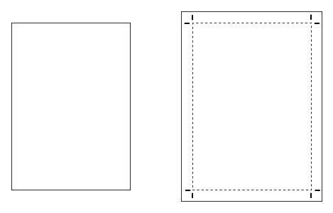
The first difference is the size of the page. Let's say you are in Europe or Asia and have been creating A4 electronic documents from a web site using ReportLab. You then need to
produce a different version of the same document for professional printing. The printer wants to be given a slightly larger document, with lines pointing at the corners of the A4 area.
They will often be printing on a much larger sheet or roll of paper, and cutting it afterwards.
To automatically create crop marks, use the 'useCropMarks' attribute of the <docinit> tab. This will enlarge the underlying page and draw the needed marks.
<docinit useCropMarks="1"/>
The intent is that it's reasonable easy now to have a single template which generates print and web versions of the same document, wrapping an <if> statement around the extra attribute in your favourite templating system, without needing to recalculate all the frame and graphics positions for every element on the page.
There is also a separate <cropMarks> tag which you can use within the <docinit> tag, if you wish to modify the page size increase, colour, length, dash pattern and so on for the crop marks; however, we've found the defaults to work fine.
Bleed
Following on from the above, remember that printers often cut the paper to size. In addition, if they are creating a booklet, they sometimes have to allow for the thickness of inner
pages, so they need a little flexibility in where to make the cut. If you have a design with solid colour 'straight to the edge' of the page, cutting can sometimes leave a very fine white
line where the colour runs out. Therefore, when a designer wants an area of colour to go 'straight to the edge', they work on a slightly larger page size, and allow the colour to overflow
or 'bleed out'. In general printers often ask for at least 3mm of bleed, or about 8 points. So, if you needed to draw a blue background on an A4 sized page (595x842 points), you would be
well advised to draw the rectangle from x=-10 to x=+605 - ten points bigger than needed. This will be completely invisible to an end user in a document created for the web; but when you turn
on crop marks and the page is enlarged, it will be visible.
There are no features in RML to automatically detect areas of colour near the edge of the page and 'add bleed'; it's your job to do it.
This also applies to bitmap images. If an image runs to the edge of the page, it needs to be sized to very slightly overflow so that it can be cut without risking a white edge.

CMYK Colours
For professional presses, colours need to be specified either as CMYK, or as 'spot colours' such as those in the Pantone Color Matching System. The CMYK process is a method of printing colour
by using four inks - cyan, magenta, yellow, and black. White is the absence of any colour. The Pantone system is a popular 'spot colour' system which describes a set of completely standardized
colours, allowing different manufacturers in different locations to ensure that their colours match.
The majority of printed material is produced using the CMYK process. Many Pantone colours have good, well-known CMYK equivalents.
RML allows you to specify colours as CMYK or by spot name, and also provides a mechanism for ensuring that your document sticks to a particular set of colour definition types.
Starting in ReportLab 2.5, a colorSpace attribute can be defined in the <document> tag.
This is a declaration of your intent, and it lets us carry out some useful checks on your behalf. It will raise an error if you accidentally use a colour that is not allowed in your colorSpace. Then, to declare a CMYK colour, use the <color> tag, within the <docinit> section at the top:
<document filename="test_045_separations.pdf" invariant="1" colorSpace="CMYK">
<docinit>
    <color id="BLUE" CMYK="[1,0.67,0,0.23]"/>
    <color id="CYAN" CMYK="[1,0,0,0]"/>
</docinit>
Note that each colour component ranges from 0 to 1, not 0 to 100; you can use any floating point number in between. Designers tend to think in terms of 0-100, but we have chosen to follow the PDF specification.
The 'id' is a string you specify. You will then be able to refer to these colours by name elsewhere in a document - for example, you can then set a table cell background or paragraph style to be "BLUE".
The colorSpace attribute is particularly important when dealing with blacks. Many objects in our framework have a default colour of black, and this is an RGB black 'under the hood'. If you set the colorSpace, our framework will 'auto-convert' blacks for you; thus if a table's gridlines or a chart axis is normally drawn in black or a shade of grey (implemented originally as RGB), it will be autoconverted to CMYK black or grey. Many printing presses are able to handle RGB and autoconvert blacks these days, but printers will appreciate it if the PDFs are pure CMYK as it won't raise alarms in their proofing tools.
Images in CMYK documents
Most bitmap images use an RGB colour model. We do NOT yet have safeguards to check images that you include in a CMYK document - the colorSpace checks won't warn you. We might add this checking in a future version. If you are working with a limited number of images, the best approach is to use a professional tool like Photoshop to create CMYK versions of those images, and check you are happy with the colours when printed.
Printers can often handle RGB images in a print job, but it's best to check with them first
Overprint and knockout control
When you create a document with two colours layered on top of one another, there are different ways to combine them. The two alternatives are known as "overprint" and "knockout". Non-primary CMYK colours are, of course, already implemented with a mix of up to four inks. A problem arises when you decide to stack two colours on top of each other. Imagine you have a red and a blue CMYK colour which are each made up of, say, 60% black (the K in CMYK), and you want to draw one on top of the other. Should the software 'merge the colours'? It can't achieve 120% coverage with the black. So, a decision is needed. Either the topmost colour 'knocks out' and replaces anything drawn underneath it, or it 'overprints', allowing the colours to mix, in a manner similar to transparency.
When working with separated colours (see below), the printing mechanics are a little different as each colour is really a bottle of ink; but again, a statement of intent is needed when they overlap - does the top colour replace what's underneath, or allow both to be laid down on the page?
The overprint-versus-knockout choice is rarely used, and works in slightly different ways for CMYK and for separated colours - see the section below. Designers will know when they need it, and the developer merely needs to set a flag.
Some PDF viewing software can simulate this effect on screen (Adobe Reader is one of them); it's necessary to go into the preferences and check a box to see how the document would appear when printed. The default for is usually to for the topmost colour to knock out the colour underneath.
<overprint mode="overprint"> turns on overprint for the drawing operations that follow. You can then set this property to its original value with <overprint mode="knockout"> when you want to go back into the default knock-out mode.


The sample first example above shows cyan, magenta and yellow circles overlapping one another, set to overprint and rendered in Acrobat Professional. Without overprint set in the second example, the inks do not mix on top of each other. Instead, the circles on top knock-out the areas that they cover underneath.
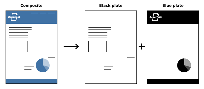
Colour separations
When a PDF document is printed professionally, layers of coloured ink (plates) will be printed one at a time on top of each other, laying down microscopic dots on different angled paths so that more than one colour can be visible. The process colours (CMYK) will normally have a plate each
for full-colour printing, but you can define your own spot colour plates to be printed with a specialist "bucket of ink". One common use is for companies to have completely standardised colours in their corporate literature, and to be able to print with just 3 plates instead of the usual 4, which saves money and increases consistency. Another case is using metallic foils or fluorescent paints to enhance areas of your publication, so you might use extra spot colours as well as the CMYK ones. Bear in mind that
spot colour inks are usually opaque.
We mentioned above that a colorSpace attribute can be defined in the <document> tag. There are two more of these "color spaces" which will be useful for those who are going to use
spot colours: 'SEP' will only let you use spot colours you define, and 'SEP_CMYK' will let you define spot colours to use along with the normal CMYK process colours.
<document filename="test_045_separations.pdf" invariant="1" colorSpace="SEP">
If using SEP_CMYK, our framework will again 'auto-convert' blacks for you; thus if a table's gridlines or a chart axis is normally drawn in black or a shade of grey (implemented originally as RGB), it will be autoconverted to CMYK black or grey.
An equivalent CMYK colour value needs to be supplied along with a spot name for each printing plate. The CMYK values are usually just to provide an on screen representation and do not need to be accurate, more important is the spot name which is a string that printers can identify the ink such as 'PANTONE 288 CV' or 'PMS_288'. Your printer may advise you on what spot names to use.
You will need to define your spot colours in the <docinit> section of your document. The 'id' is what you will use later in the document to refer to that colour, 'CMYK' allows you to see an approximation of your colour in a PDF reader, 'spotName' is how the printer will identify which ink to use for the plate. There is also an optional 'density' attribute which allows you to print with a thinner (or half-tone) layer of ink. If you set a density lower than 1.0, you don't need to fiddle with the CMYK values for on-screen preview; we do that for you.
<document filename="test_045_separations.pdf" invariant="1" colorSpace="SEP">
<docinit>
    <color id="BLACK" CMYK="[0,0,0,1]"/>
    <color id="BLUE" CMYK="[1,0.67,0,0.23]" spotName="PANTONE 288 CV"/>
    <color id="BLUE75" CMYK="[1,0.67,0,0.23]" spotName="PANTONE 288 CV" density=".75"/>
</docinit>
If you have access to Adobe Acrobat Professional or other print pre-flight tool you will be able to preview each of the plates separately and the inks that are used.
The overprint tag is perhaps even more useful when working with spot colours; for example, we have worked with pie charts where the overall document was limited to black and a specific Pantone blue, and the designer was able to create some new tints by stacking the blue and black on top of each other.
A document that is intended to be printed as a bound booklet on a press must always have a page count that is a multiple of four. Even with a different binding technique, documents laid out for print may make use of left and right facing pages which "go together". RML documents with dynamic content will in many cases be of highly variable length, and not guided by the designer's "common sense".
It is possible to use the conditional formatting tags in RML to add extra pages and pad out your document to the required length as necessary. For example, we maintain one solution which has a number of optional half-page and full-page advertisements which can be used to ensure the right pagination occurs. See the 'Conditional Formatting' chapter of this guide for more
information on this technique.
We manage a number of solutions which generate documents for professional printing, and have helped clients achieve some interesting effects, but we have limited space here to discuss all of the techniques used. If you are a commercial customer and are seeking to achieve something not documented here, please contact us and we will be happy to assist further.