Chapter 8: Miscellaneous useful features
pageNumber
<stylesheet>
    <initialize>
        <name id="YourVariableName"
              value="Type anything you want between these quotes..."/>
        <namedString id="x">0</namedString>
        <namedString id="anothervariable" indexName="x">value of anothervariable</namedString>
    </initialize>
</stylesheet>

<story>
    <para>
        <b><getName id="YourVariableName"/></b>
        <b><getName id="anothervariable" indexName="x"/></b>
    </para>
</story>
Seq, seqReset, seqChain and SeqFormat
<seq/>
<seqDefault id="myID"/>
<seqReset/> or <seqReset id="myID"/>
<seqChain order="id0 id1 id2...idn"/>
<seqFormat id="myID" value="i"/>
| Value | Meaning |
|---|---|
| 1 | Decimal |
| i | Lowercase Roman |
| I | Uppercase Roman |
| a | Lowercase Alphabetic |
| A | Uppercase Alphabetic |
Tabs
<?xml version="1.0" encoding="iso-8859-1" standalone="no" ?>
<!DOCTYPE document SYSTEM "../rml.dtd">
<document filename="example_6.pdf">
<template>
<pageTemplate id="main">
<frame id="first" x1="72" y1="72" width="451" height="698"/>
</pageTemplate>
</template>
<stylesheet>
</stylesheet>
<story>
<h1>
seq in seq, seqDefault and seqReset
</h1>
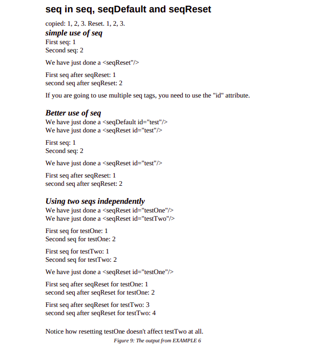
<para>copied: <seq id="spam"/>, <seq id="spam"/>, <seq id="spam"/>.
Reset<seqReset id="spam"/>. <seq id="spam"/>, <seq id="spam"/>,
<seq id="spam"/>.</para>
<h2>
<i>simple use of seq</i>
</h2>
<para>
First seq: <seq/>
</para>
<para>
Second seq: <seq/>
</para>
<spacer length="6"/>
<para>
<seqReset/>
We have just done a <seqReset"/>
</para>
<spacer length="6"/>
<para>
First seq after seqReset: <seq/>
</para>
<para>
second seq after seqReset: <seq/>
</para>
<spacer length="6"/>
<para>
If you are going to use multiple seq tags, you need to use the "id" attribute.
</para>
<h2>
<i>Better use of seq</i>
</h2>
<para>
<seqDefault id="test"/>
We have just done a <seqDefault id="test"/>
</para>
<para>
<seqReset id="test"/>
We have just done a <seqReset id="test"/>
</para>
<spacer length="6"/>
<para>
First seq: <seq id="test"/>
</para>
<para>
Second seq: <seq id="test"/>
</para>
<spacer length="6"/>
<para>
<seqReset id="test"/>
We have just done a <seqReset id="test"/>
</para>
<spacer length="6"/>
<para>
First seq after seqReset: <seq id="test"/>
</para>
<para>
second seq after seqReset: <seq id="test"/>
</para>
<h2>
<i>Using two seqs independently</i>
</h2>
<para>
<seqReset id="testOne"/>
We have just done a <seqReset id="testOne"/>
</para>
<para>
<seqReset id="testTwo"/>
We have just done a <seqReset id="testTwo"/>
</para>
<spacer length="6"/>
<para>
First seq for testOne: <seq id="testOne"/>
</para>
<para>
Second seq for testOne: <seq id="testOne"/>
</para>
<spacer length="6"/>
<para>
First seq for testTwo: <seq id="testTwo"/>
</para>
<para>
Second seq for testTwo: <seq id="testTwo"/>
</para>
<spacer length="6"/>
<para>
<seqReset id="testOne"/>
We have just done a <seqReset id="testOne"/>
</para>
<spacer length="6"/>
<para>
First seq after seqReset for testOne: <seq id="testOne"/>
</para>
<para>
second seq after seqReset for testOne: <seq id="testOne"/>
</para>
<spacer length="6"/>
<para>
First seq after seqReset for testTwo: <seq id="testTwo"/>
</para>
<para>
second seq after seqReset for testTwo: <seq id="testTwo"/>
</para>
<spacer length="15"/>
<para>
Notice how resetting testOne doesn't affect testTwo at all.
</para>
</story>
</document>
Entities
When you need to use "<", replace it with "<",
when you need to use ">;", replace it with ">",
and when you need to use "&", replace it with "& amp;".
Aliases
CDATA -- unparsed character data
<xpre>
    <![CDATA[
Anything could go here. <non_existant_tags/>, "&" signs.
Whatever you want. RML ignores it.
]] >
</xpre>
Plug-ins: plugInGraphic and plugInFlowable
<plugInGraphic module="mymodule" function="myfunction">data string</plugInGraphic>
import mymodule
mymodule.myfunction(canvas, "data string")
<plugInFlowable module="mymodule" function="myfunction">data string</plugInFlowable>
import mymodule
flowable=mymodule.myfunction("data string")
story.append(flowable)
Integrating with PageCatcher: catchForms, doForm and includePdfPages
<pageDrawing>
    <catchForms storageFile="storage.data"/>
    <doForm name="PF0"/>
</pageDrawing>
<illustration width="451" height="698">
    <pageGraphics>
        <catchForms storageFile="samples.data"/>
        <doForm name="PF0"/>
    </pageGraphics>
</illustration>

<illustration width="451" height="698">
    <pageGraphics>
        <doForm name="PF1"/>
    </pageGraphics>
</illustration>
<includePdfPages filename="mypdffile.pdf"/>
<includePdfPages filename="mypdffile.pdf"/>
<includePdfPages filename="mypdffile.pdf" pages="1"/>
<includePdfPages filename="mypdffile.pdf" pages="1,2,3"/>
<includePdfPages filename="mypdffile.pdf" pages="2,1,1,2,2"/>
<includePdfPages filename="mypdffile.pdf" pages="1-5"/>
<includePdfPages filename="mypdffile.pdf" pages="1,2,4-5"/>
<setNextTemplate>

    <setNextTemplate name="myIncludePagesTemplate"/>
    <includePdfPages filename="mypdffile.pdf" pages="1,2,3"/>
    <setNextTemplate name="myNormalTemplate"/>
    <nextFrame/>

    <para>
        This text appears on the next normal (non-included) page of your
        document)
    </para>
| filename | filename to include |
|---|---|
| pages | The page list |
| template | optional page template name |
| outlineText | optional outline text |
| outlineLevel | optional outline level |
| outlineClosed | true for closed outline |
| leadingFrame | (yes | no | 0 | 1 | notAtTop): no if you don't want a page throw before the first page |
| isdata | boolean true if the file is a pageCatcher .data file |
| orientation |
Outlines
    <outlineAdd>First outline entry</outlineAdd>
    <outlineAdd level="1">sub entry</outlineAdd>
    <outlineAdd closed="true">Second outline entry 2</outlineAdd>
    <outlineAdd level="1">sub entry 2</outlineAdd>
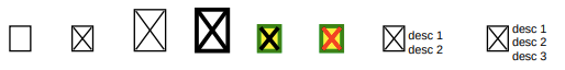
Form field tags
Tabs
<checkBox x="0cm" y="0cm" checked="0"/>

<checkBox x="1.5cm" y="0cm" checked="1"/>

<checkBox x="3cm" y="0cm"
          boxWidth="0.75cm" boxHeight="1cm"
          checked="1"/>

<checkBox x="4.5cm" y="0cm"
          boxWidth="0.75cm" boxHeight="1cm"
          lineWidth="0.1cm"
          checked="1"/>

<checkBox x="6cm" y="0cm"
          lineWidth="0.1cm"
          boxFillColor="yellow" boxStrokeColor="green"
          checked="1"/>

<checkBox x="7.5cm" y="0cm"
          lineWidth="0.1cm"
          boxFillColor="yellow" boxStrokeColor="green"
          checkStrokeColor="red"
          checked="1"/>

<checkBox x="9cm" y="0"
          line1="desc 1"
          line2="desc 2"
          checked="1"/>

<checkBox x="11.5cm" y="0"
          line1="desc 1"
          line2="desc 2"
          line3="desc 3"
          checked="1"/>
Tabs
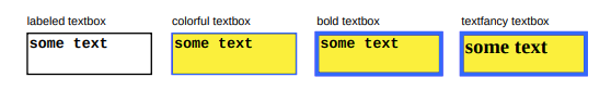
<illustration width="18cm" height="2cm">
<textBox x="0cm" y="0cm"
boxWidth="3cm" boxHeight="1cm"
label="labeled textbox">some text</textBox>

<textBox x="3.5cm" y="0cm"
boxWidth="3cm" boxHeight="1cm"
boxFillColor="yellow" boxStrokeColor="blue"
label="colorful textbox">some text</textBox>

<textBox x="7cm" y="0cm"
lineWidth="0.1cm"
boxWidth="3cm" boxHeight="1cm"
boxFillColor="yellow" boxStrokeColor="blue"
label="bold textbox">some text</textBox>

<textBox x="10.5cm" y="0cm"
boxWidth="3cm" boxHeight="1cm"
lineWidth="0.1cm"
boxFillColor="yellow" boxStrokeColor="blue"
fontName="Times-Bold"
fontSize="14"
label="textfancy textbox">some text</textBox>
</illustration>
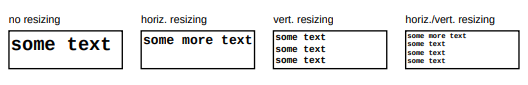
Tabs
<textBox x="0cm" y="0cm"
         boxWidth="3cm" boxHeight="1cm"
         fontSize="14"
         label="no resizing">some text</textBox>

<textBox x="3.5cm" y="0cm"
         boxWidth="3cm" boxHeight="1cm"
         fontSize="14"
         label="horiz. resizing">some more text</textBox>

<textBox x="7cm" y="0cm"
         boxWidth="3cm" boxHeight="1cm"
         shrinkToFit="1"
         fontSize="14"
         label="vert. resizing">some text
    some text
    some text</textBox>

<textBox x="10.5cm" y="0cm"
         boxWidth="3cm" boxHeight="1cm"
         shrinkToFit="1"
         fontSize="14"
         label="horiz./vert. resizing">some more text
    some text
    some text
    some text</textBox>
Tabs
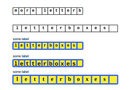
<letterBoxes x="0cm" y="7.5cm"
             count="12">letterboxes</letterBoxes>

<letterBoxes x="0cm" y="6cm"
             count="12">more letterboxes</letterBoxes>

<letterBoxes x="0cm" y="4.5cm"
             boxWidth="0.75cm"
             count="12">letterboxes</letterBoxes>

<letterBoxes x="0cm" y="3cm"
             lineWidth="0.1cm"
             boxFillColor="yellow" boxStrokeColor="blue"
             label="some label"
             count="12">letterboxes</letterBoxes>

<letterBoxes x="0cm" y="1.5cm"
             lineWidth="0.1cm"
             boxFillColor="yellow" boxStrokeColor="blue"
             label="some label"
             fontName="Courier-Bold"
             fontSize="14"
             count="12">letterboxes</letterBoxes>

<letterBoxes x="0cm" y="0cm"
             lineWidth="0.1cm"
             boxWidth="0.75cm" boxHeight="0.75cm"
             boxFillColor="yellow" boxStrokeColor="blue"
             label="some label"
             fontName="Times-Bold"
             fontSize="14"
             count="12">letterboxes</letterBoxes>
Tabs
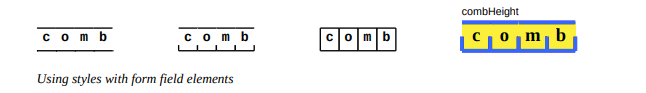
<letterBoxes x="0cm" y="0cm"
             combHeight="0"
             count="4">comb</letterBoxes>

<letterBoxes x="3.75cm" y="0cm"
             combHeight="0.25"
             count="4">comb</letterBoxes>

<letterBoxes x="7.5cm" y="0cm"
             combHeight="1"
             count="4">comb</letterBoxes>

<letterBoxes x="11.25cm" y="0cm"
             lineWidth="0.1cm"
             boxWidth="0.75cm" boxHeight="0.75cm"
             boxFillColor="yellow" boxStrokeColor="blue"
             label="combHeight"
             fontName="Times-Bold"
             fontSize="14"
             combHeight="0.5"
             count="4">comb</letterBoxes>
Tabs
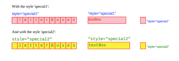
<boxStyle name="special1"
          labelFontName="Helvetica"
          fontSize="10"
          alignment="RIGHT"
          textColor="red"
          fontName="Helvetica"
          labelFontSize="10"
          labelAlignment="RIGHT"
          labelTextColor="blue"
          boxStrokeColor="red"
          boxFillColor="pink"/>

<boxStyle name="special2"
          parent="special1"
          fontName="Courier"
          fontSize="12"
          textColor="green"
          labelFontName="Courier"
          labelFontSize="12"
          labelTextColor="green"
          boxFillColor="yellow"
          boxStrokeColor="red"/>
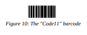
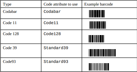
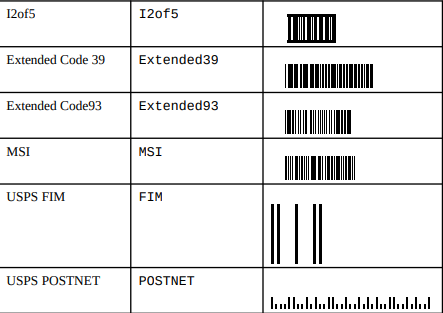
<barCode x="1cm" y="0" code="Code11">123456</barCode>
Output
Interactive Form Field tags
RML supports the following interactive form elements
textField Attributes
| Attribute | Meaning | Default |
|---|---|---|
| name | the radio's group (ie parameter) name | None |
| value | Value of the text field | '' |
| x | the horizontal position on the page (absolute coordinates) | 0 |
| y | the vertical position on the page (absolute coordinates) | 0 |
| width | The widget width | 120 |
| height | The widget height | 36 |
| fontName | The name of the type 1 font to be used | 'Helvetica' |
| fontSize | The size of font to be used | 12 |
| maxlen | None or maximum length of the widget value | 100 |
| fillColor | colour to be used to fill the widget | None |
| textColor | the colour of the symbol or text | None |
| borderWidth | as it says | 1 |
| borderColor | the widget's border colour | None |
| borderStyle | The border style name | 'solid' |
| tooltip | The text to display when hovering over the widget | None |
| annotationFlags | blank separated string of annotation flags | |
| fieldFlags | Blank separated field flags (see below) | |
| forceBorder | when true a border force a border to be drawn | False |
| relative | if true obey the current canvas transform | False |
| multiline | if true then add multiline flag",'true'], | |
| dashLen | the dashline to be used if the borderStyle=='dashed' | 3"] |
checkboxField Attributes
| Attribute | Meaning | Default |
|---|---|---|
| name | the radio's group (ie parameter) name | None |
| value | Value of the text field | '' |
| x | the horizontal position on the page (absolute coordinates) | 0 |
| y | the vertical position on the page (absolute coordinates) | 0 |
| size | The outline dimensions size x size | 20 |
| checked | if True the checkbox is initially checked | False |
| buttonStyle | the checkbox style (see below) | check |
| shape | The outline of the widget (see below) | square |
| fillColor | colour to be used to fill the widget | None |
| textColor | the colour of the symbol or text | None |
| borderWidth | as it says | 1 |
| borderColor | the widget's border colour | None |
| borderStyle | The border style name | 'solid' |
| tooltip | The text to display when hovering over the widget | None |
| annotationFlags | blank separated string of annotation flags | 'print' |
| fieldFlags | Blank separated field flags (see below) | required |
| forceBorder | when true a border force a border to be drawn | False |
| relative | if true obey the current canvas transform | False |
| dashLen | the dashline to be used if the borderStyle=='dashed' | 3 |
radioField Attributes
| Attribute | Meaning | Default |
|---|---|---|
| name | the radio's group (ie parameter) name | None |
| value | Value of the text field | '' |
| name | the radio's group (ie parameter) name | None |
| value | the radio's group name | None |
| x | the horizontal position on the page (absolute coordinates) | 0 |
| y | the vertical position on the page (absolute coordinates) | 0 |
| size | The outline dimensions size x size | 20 |
| selected | if True this radio is the selected one in its group | False |
| buttonStyle | the checkbox style (see below) | check |
| shape | The outline of the widget (see below) | square |
| fillColor | colour to be used to fill the widget | None |
| textColor | the colour of the symbol or text | None |
| borderWidth | as it says | 1 |
| borderColor | the widget's border colour | None |
| borderStyle | The border style name | 'solid' |
| tooltip | The text to display when hovering over the widget | None |
| annotationFlags | blank separated string of annotation flags | |
| fieldFlags | Blank separated field flags (see below) | noToggleToOff required radio |
| forceBorder | when true a border force a border to be drawn | False |
| relative | if true obey the current canvas transform | False |
| dashLen | the dashline to be used if the borderStyle=='dashed' | 3 |
choiceField Attributes
| Attribute | Meaning | Default |
|---|---|---|
| name | the radio's group (ie parameter) name | None |
| value | Value of the text field | '' |
| name | the radio's group (ie parameter) name | None |
| options | List or tuple of avaiable options | [] |
| value | Singleton or list of strings of selected options | [] |
| x | the horizontal position on the page (absolute coordinates) | 0 |
| y | the vertical position on the page (absolute coordinates) | 0 |
| width | The widget width | 120 |
| height | The widget height | 36 |
| fontName | The name of the type 1 font to be used | 'Helvetica' |
| fontSize | The size of font to be used | 12 |
| fillColor | colour to be used to fill the widget | None |
| textColor | the colour of the symbol or text | None |
| borderWidth | as it says | 1 |
| borderColor | the widget's border colour | None |
| borderStyle | The border style name | 'solid' |
| tooltip | The text to display when hovering over the widget | None |
| annotationFlags | blank separated string of annotation flags | |
| fieldFlags | Blank separated field flags (see below) | combo |
| forceBorder | when true a border force a border to be drawn | False |
| relative | if true obey the current canvas transform | False |
| dashLen | the dashline to be used if the borderStyle=='dashed' | 3 |
| maxlen | None or maximum length of the widget value | None |
listboxField Attributes
| Attribute | Meaning | Default |
|---|---|---|
| name | the radio's group (ie parameter) name | None |
| value | Value of the text field | '' |
| name | the radio's group (ie parameter) name | None |
| options | List or tuple of avaiable options | [] |
| value | Singleton or list of strings of selected options | [] |
| x | the horizontal position on the page (absolute coordinates) | 0 |
| y | the vertical position on the page (absolute coordinates) | 0 |
| width | The widget width | 120 |
| height | The widget height | 36 |
| fontName | The name of the type 1 font to be used | 'Helvetica' |
| fontSize | The size of font to be used | 12 |
| fillColor | colour to be used to fill the widget | None |
| textColor | the colour of the symbol or text | None |
| borderWidth | as it says | 1 |
| borderColor | the widget's border colour | None |
| borderStyle | The border style name | 'solid' |
| tooltip | The text to display when hovering over the widget | None |
| annotationFlags | blank separated string of annotation flags | |
| fieldFlags | Blank separated field flags (see below) | |
| forceBorder | when true a border force a border to be drawn | False |
| relative | if true obey the current canvas transform | False |
| dashLen | the dashline to be used if the borderStyle=='dashed' | 3 |
Button styles
- cross
- circle
- star
- diamond
Widget shape
- circle
- square
Border style
- solid
- dashed
- inset
- bevelled
- underlined
Field Flag Tokens and values
| Token | Meaning | Value |
|---|---|---|
| readOnly | The widget is read only | 1<<0 |
| required | the widget is required | 1<<1 |
| noExport | don't export the widget value | 1<<2 |
| noToggleToOff | radios one only must be on | 1<<14 |
| radio | added by the radio method | 1<<15 |
| pushButton | if the button is a push button | 1<<16 |
| radiosInUnison | radios with the same value toggle together | 1<<25 |
| multiline | for multiline text widget | 1<<12 |
| password | password textfield | 1<<13 |
| fileSelect | file selection widget | 1<<20 |
| doNotSpellCheck | as it says | 1<<22 |
| doNotScroll | text fields do not scroll | 1<<23 |
| comb | make a comb style text based on the maxlen value | 1<<24 |
| richText | if rich text is used | 1<<25 |
| combo | for choice fields | 1<<17 |
| edit | if the choice is editable | 1<<18 |
| sort | if the values should be sorted | 1<<19 |
| multiSelect | if the choice allows multi-select | 1<<21 |
| commitOnSelChange | not used by reportlab | 1<<26 |
Annotation Flag Tokens and values
| Token | Meaning | Value |
|---|---|---|
| invisible | The widget is not shown | 1<<0 |
| hidden | The widget is hidden | 1<<1 |
| The widget will print | 1<<2 | |
| nozoom | The annotation will notscale with the rendered page | 1<<3 |
| norotate | The widget won't rotate with the page | 1<<4 |
| noview | Don't render the widget | 1<<5 |
| readonly | Widget cannot be interacted with | 1<<6 |
| locked | The widget cannot be changed | 1<<7 |
| togglenoview | Teh widget may be viewed after some events | 1<<8 |
| lockedcontents | The contents of the widget are fixed | 1<<9 |
Colorspace Checking
- MIXED - The default. As in RML versions before 2.5, rgb, cmyk, spot colors and 'named' colors can all be used.
- RGB - Permits only the use of RGB colour values.
- CMYK - Permits only the use of CMYK colour values.
- SEP - 'Spot Colors' only - all colour values must define a 'spotName' value.
- SEP_BLACK - spot colors, plus shades of grey only.
- SEP_CMYK - spot colors plus cmyk values only.
Balanced Column
ncols - Sets the number of columnns content should be split
needed - Sets the minimum space needed by the flowable (default is 72 points)
spaceBefore - Sets space before the content
spaceAfter - Sets space after the content
showBoundary - Draws a boundary box around each column
leftPadding - Sets left paddings
innerPadding - Sets inner padding
rightPadding - Sets right padding
topPadding - Sets top padding
bottomPadding - Sets bottom padding