Graphics
Introduction
ReportLab Graphics is one of the sub-packages to the ReportLab library. It started off as a stand-alone set of programs, but is now a fully integrated part of the ReportLab toolkit that allows you to use its powerful charting and graphics features to improve your PDF forms and reports.
General Concepts
In this section we will present some of the more fundamental principles of the graphics library, which will show-up later in various places.
Drawings and Renderers
A Drawing is a platform-independent description of a collection of shapes. It is not directly associated with PDF, Postscript or any other output format. Fortunately, most vector graphics systems have followed the Postscript model and it is possible to describe shapes unambiguously.
A drawing contains a number of primitive Shapes. Normal shapes are those widely known as rectangles, circles, lines, etc. One special (logic) shape is a Group, which can hold other shapes and apply a transformation to them. Groups represent composites of shapes and allow to treat the composite as if it were a single shape. Just about anything can be built up from a small number of basic shapes.
The package provides several Renderers which know how to draw a drawing into different formats. These include PDF (renderPDF), Postscript (renderPS), and bitmap output (renderPM). The bitmap renderer uses Raph Levien's libart rasterizer and Fredrik Lundh's Python Imaging Library (PIL). The SVG renderer makes use of Python's standard library XML modules, so you don't need to install the XML-SIG's additional package named PyXML. If you have the right extensions installed, you can generate drawings in bitmap form for the web as well as vector form for PDF documents, and get "identical output".
The PDF renderer has special "privileges" - a Drawing object is also a Flowable and, hence, can be placed directly in the story of any Platypus document, or drawn directly on a Canvas with one line of code. In addition, the PDF renderer has a utility function to make a one-page PDF document quickly.
The SVG renderer is special as it is still pretty experimental. The SVG code it generates is not really optimised in any way and maps only the features available in ReportLab Graphics (RLG) to SVG. This means there is no support for SVG animation, interactivity, scripting or more sophisticated clipping, masking or graduation shapes. So, be careful, and please report any bugs you find!
Coordinate System
The Y-direction in our X-Y coordinate system points from the bottom up. This is consistent with PDF, Postscript and mathematical notation. It also appears to be more natural for people, especially when working with charts. Note that in other graphics models (such as SVG) the Y-coordinate points down. For the SVG renderer this is actually no problem as it will take your drawings and flip things as needed, so your SVG output looks just as expected.
The X-coordinate points, as usual, from left to right. So far there doesn't seem to be any model advocating the opposite direction - at least not yet (with interesting exceptions, as it seems, for Arabs looking at time series charts...).
Getting Started
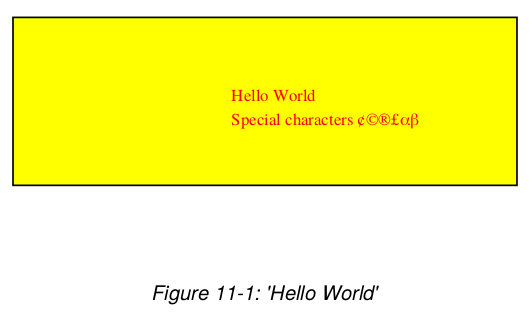
Let's create a simple drawing containing the string "Hello World" and some special characters, displayed on top of a coloured rectangle. After creating it we will save the drawing to a standalone PDF file.
from reportlab.lib import colors
from reportlab.graphics.shapes import *

d = Drawing(400, 200)
d.add(Rect(50, 50, 300, 100, fillColor=colors.yellow))
d.add(String(150,100, 'Hello World', fontSize=18, fillColor=colors.red))
d.add(String(180,86, 'Special characters \\\\xc2\\xa2\\xc2\\xa9\\xc2\\xae\\xc2\\xa3\\xce\\xb1\\xce\\xb2',
             fillColor=colors.red))

from reportlab.graphics import renderPDF
renderPDF.drawToFile(d, 'example1.pdf', 'My First Drawing')
This will produce a PDF file containing the following graphic:
Each renderer is allowed to do whatever is appropriate for its format,
and may have whatever API is needed.
If it refers to a file format, it usually has a drawToFile function,
and that's all you need to know about the renderer.
Let's save the same drawing in Encapsulated Postscript format:
from reportlab.graphics import renderPS
renderPS.drawToFile(d, 'example1.eps')
from reportlab.graphics import renderPM
renderPM.drawToFile(d, 'example1.png', 'PNG')
Many other bitmap formats, like GIF, JPG, TIFF, BMP and PPN are genuinely available, making it unlikely you'll need to add external postprocessing steps to convert to the final format you need.
To produce an SVG file containing the identical drawing, which may be imported into graphical editing tools such as Illustrator all we need to do is write code like this:
from reportlab.graphics import renderSVG
renderSVG.drawToFile(d, 'example1.svg')
Attribute Verification
Python is very dynamic and lets us execute statements at run time that can easily be the source for unexpected behaviour. One subtle 'error' is when assigning to an attribute that the framework doesn't know about because the used attribute's name contains a typo. Python lets you get away with it (adding a new attribute to an object, say), but the graphics framework will not detect this 'typo' without taking special counter-measures.
There are two verification techniques to avoid this situation. The default is for every object to check every assignment at run time, such that you can only assign to 'legal' attributes. This is what happens by default. As this imposes a small performance penalty, this behaviour can be turned off when you need it to be.
>>> r = Rect(10,10,200,100, fillColor=colors.red)
>>>
>>> r.fullColor = colors.green # note the typo
>>> r.x = 'not a number'       # illegal argument type
>>> del r.width                # that should confuse it
These statements would be caught by the compiler in a statically typed language, but Python lets you get away with it. The first error could leave you staring at the picture trying to figure out why the colors were wrong. The second error would probably become clear only later, when some back-end tries to draw the rectangle. The third, though less likely, results in an invalid object that would not know how to draw itself.
>>> r = shapes.Rect(10,10,200,80)
>>> r.fullColor = colors.green
Traceback (most recent call last):
  File "<interactive input>", line 1, in ?
  File "C:\\code\\users\\andy\\graphics\\shapes.py", line 254, in __setattr__
    validateSetattr(self,attr,value)    #from reportlab.lib.attrmap
  File "C:\\code\\users\\andy\\lib\\attrmap.py", line 74, in validateSetattr
    raise AttributeError, "Illegal attribute '%s' in class %s" % (name, obj.__class__.__name__)
AttributeError: Illegal attribute 'fullColor' in class Rect
>>>
This imposes a performance penalty, so this behaviour can be turned off when you need it to be. To do this, you should use the following lines of code before you first import reportlab.graphics.shapes:
>>> import reportlab.rl_config
>>> reportlab.rl_config.shapeChecking = 0
>>> from reportlab.graphics import shapes
Once you turn off shapeChecking, the classes are actually built
without the verification hook; code should get faster, then.
Currently the penalty seems to be about 25% on batches of charts,
so it is hardly worth disabling.
However, if we move the renderers to C in future (which is eminently
possible), the remaining 75% would shrink to almost nothing and
the saving from verification would be significant.
Each object, including the drawing itself, has a verify() method.
This either succeeds, or raises an exception.
If you turn off automatic verification, then you should explicitly
call verify() in testing when developing the code, or perhaps
once in a batch process.
Property Editing
A cornerstone of the reportlab/graphics which we will cover below is that you can automatically document widgets. This means getting hold of all of their editable properties, including those of their subcomponents.
Another goal is to be able to create GUIs and config files for drawings. A generic GUI can be built to show all editable properties of a drawing, and let you modify them and see the results. The Visual Basic or Delphi development environment are good examples of this kind of thing. In a batch charting application, a file could list all the properties of all the components in a chart, and be merged with a database query to make a batch of charts.
To support these applications we have two interfaces, getProperties
and setProperties, as well as a convenience method dumpProperties.
The first returns a dictionary of the editable properties of an
object; the second sets them en masse.
If an object has publicly exposed 'children' then one can recursively
set and get their properties too.
This will make much more sense when we look at Widgets later on,
but we need to put the support into the base of the framework.
>>> r = shapes.Rect(0,0,200,100)
>>> import pprint
>>> pprint.pprint(r.getProperties())
{'fillColor': Color(0.00,0.00,0.00),
 'height': 100,
 'rx': 0,
 'ry': 0,
 'strokeColor': Color(0.00,0.00,0.00),
 'strokeDashArray': None,
 'strokeLineCap': 0,
 'strokeLineJoin': 0,
 'strokeMiterLimit': 0,
 'strokeWidth': 1,
 'width': 200,
 'x': 0,
 'y': 0}
>>> r.setProperties({'x':20, 'y':30, 'strokeColor': colors.red})
>>> r.dumpProperties()
fillColor = Color(0.00,0.00,0.00)
height = 100
rx = 0
ry = 0
strokeColor = Color(1.00,0.00,0.00)
strokeDashArray = None
strokeLineCap = 0
strokeLineJoin = 0
strokeMiterLimit = 0
strokeWidth = 1
width = 200
x = 20
y = 30
Note: pprint is the standard Python library module that allows
you to 'pretty print' output over multiple lines rather than having
one very long line.
These three methods don't seem to do much here, but as we will see they make our widgets framework much more powerful when dealing with non-primitive objects.
Naming Children
You can add objects to the Drawing and Group objects.
These normally go into a list of contents.
However, you may also give objects a name when adding them.
This allows you to refer to and possibly change any element
of a drawing after constructing it, eg
>>> d = shapes.Drawing(400, 200)
>>> s = shapes.String(10, 10, 'Hello World')
>>> d.add(s, 'caption')
>>> s.caption.text
'Hello World'
>>>
Note that you can use the same shape instance in several contexts
in a drawing; if you choose to use the same Circle object in many
locations (e.g. a scatter plot) and use different names to access
it, it will still be a shared object and the changes will be
global.
This provides one paradigm for creating and modifying interactive drawings.
Charts
The motivation for much of this is to create a flexible chart package. This section presents a treatment of the ideas behind our charting model, what the design goals are and what components of the chart package already exist.
Design Goals
Here are some of the design goals:
Make simple top-level use really simple
Allow precise positioning
Control child elements individually or as a group
d = Drawing(400,200)
pc = Pie()
pc.x = 150
pc.y = 50
pc.data = [10,20,30,40,50,60]
pc.labels = ['a','b','c','d','e','f']
pc.slices.strokeWidth=0.5
pc.slices[3].popout = 20
pc.slices[3].strokeWidth = 2
pc.slices[3].strokeDashArray = [2,2]
pc.slices[3].labelRadius = 1.75
pc.slices[3].fontColor = colors.red
d.add(pc, '')
Only expose things you should change
Composition and component based
c = MyChartWithLegend()
c.legend = MyNewLegendClass()    # just change it
c.legend.swatchRadius = 5    # set a property only relevant to the new one
c.data = [10,20,30]   #   and then configure as usual...
Multiples
Key Concepts and Components
Overview
A chart or plot is an object which is placed on a drawing; it is not itself a drawing. You can thus control where it goes, put several on the same drawing, or add annotations.
Charts have two axes; axes may be Value or Category axes. Axes in turn have a Labels property which lets you configure all text labels or each one individually. Most of the configuration details which vary from chart to chart relate to axis properties, or axis labels.
Objects expose properties through the interfaces discussed in the previous section; these are all optional and are there to let the end user configure the appearance. Things which must be set for a chart to work, and essential communication between a chart and its components, are handled through methods.
You can subclass any chart component and use your replacement instead of the original provided you implement the essential methods and properties.
Labels
A label is a string of text attached to some chart element. They are used on axes, for titles or alongside axes, or attached to individual data points. Labels may contain newline characters, but only one font.
The text and 'origin' of a label are typically set by its parent object. They are accessed by methods rather than properties. Thus, the X axis decides the 'reference point' for each tickmark label and the numeric or date text for each label. However, the end user can set properties of the label (or collection of labels) directly to affect its position relative to this origin and all of its formatting.
from reportlab.graphics import shapes
from reportlab.graphics.charts.textlabels import Label
from reportlab.graphics.shapes import Drawing
from reportlab.lib import colors


d = Drawing(200, 100)

# mark the origin of the label
d.add(shapes.Circle(100,90, 5, fillColor=colors.green))

lab = Label()
lab.setOrigin(100,90)
lab.boxAnchor = 'ne'
lab.angle = 45
lab.dx = 0
lab.dy = -20
lab.boxStrokeColor = colors.green
lab.setText('Some\nMulti-Line\nLabel')

d.add(lab)
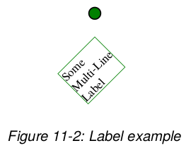
In the drawing above, the label is defined relative to the green blob. The text box should have its north-east corner ten points down from the origin, and be rotated by 45 degrees about that corner.
At present labels have the following properties, which we believe are sufficient for all charts we have seen to date:
| Property | Meaning |
|---|---|
| dx | The label's x displacement. |
| dy | The label's y displacement. |
| angle | The angle of rotation (counterclockwise) applied to the label. |
| boxAnchor | The label's box anchor, one of 'n', 'e', 'w', 's', 'ne', 'nw', 'se', 'sw'. |
| textAnchor | The place where to anchor the label's text, one of 'start', 'middle', 'end'. |
| boxFillColor | The fill color used in the label's box. |
| boxStrokeColor | The stroke color used in the label's box. |
| boxStrokeWidth | The line width of the label's box. |
| fontName | The label's font name. |
| fontSize | The label's font size. |
| leading | The leading value of the label's text lines. |
| x | The X-coordinate of the reference point. |
| y | The Y-coordinate of the reference point. |
| width | The label's width. |
| height | The label's height. |
To see many more examples of Label objects with different
combinations of properties, please have a look into the
ReportLab test suite in the folder tests, run the
script test_charts_textlabels.py and look at the PDF document
it generates!
Axes
We identify two basic kinds of axes - Value and Category ones. Both come in horizontal and vertical flavors. Both can be subclassed to make very specific kinds of axis. For example, if you have complex rules for which dates to display in a time series application, or want irregular scaling, you override the axis and make a new one.
Axes are responsible for determining the mapping from data to image coordinates; transforming points on request from the chart; drawing themselves and their tickmarks, gridlines and axis labels.
This drawing shows two axes, one of each kind, which have been created directly without reference to any chart:
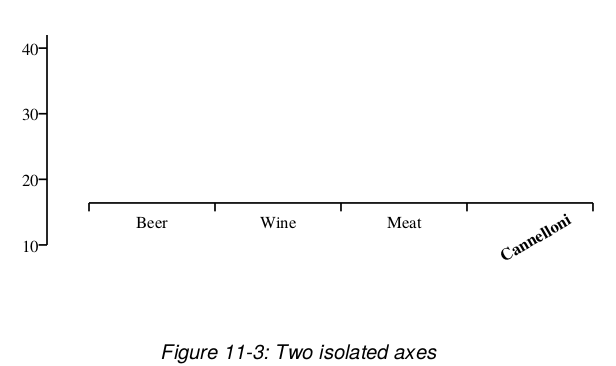
Here is the code that created them:
from reportlab.graphics import shapes
from reportlab.graphics.charts.axes import XCategoryAxis,YValueAxis
from reportlab.graphics.shapes import Drawing

drawing = Drawing(400, 200)

data = [(10, 20, 30, 40), (15, 22, 37, 42)]

xAxis = XCategoryAxis()
xAxis.setPosition(75, 75, 300)
xAxis.configure(data)
xAxis.categoryNames = ['Beer', 'Wine', 'Meat', 'Cannelloni']
xAxis.labels.boxAnchor = 'n'
xAxis.labels[3].dy = -15
xAxis.labels[3].angle = 30
xAxis.labels[3].fontName = 'Times-Bold'

yAxis = YValueAxis()
yAxis.setPosition(50, 50, 125)
yAxis.configure(data)

drawing.add(xAxis)
drawing.add(yAxis)
Remember that, usually, you won't have to create axes directly; when using a standard chart, it comes with ready-made axes. The methods are what the chart uses to configure it and take care of the geometry. However, we will talk through them in detail below. The orthogonally dual axes to those we describe have essentially the same properties, except for those refering to ticks.
XCategoryAxis class
A Category Axis doesn't really have a scale; it just divides itself
into equal-sized buckets.
It is simpler than a value axis.
The chart (or programmer) sets its location with the method
setPosition(x, y, length).
The next stage is to show it the data so that it can configure
itself.
This is easy for a category axis - it just counts the number of
data points in one of the data series. The reversed attribute (if 1)
indicates that the categories should be reversed.
When the drawing is drawn, the axis can provide some help to the
chart with its scale() method, which tells the chart where
a given category begins and ends on the page.
We have not yet seen any need to let people override the widths
or positions of categories.
An XCategoryAxis has the following editable properties:
| Property | Meaning |
|---|---|
| visible | Should the axis be drawn at all? Sometimes you don't want to display one or both axes |
| strokeColor | Color of the axis |
| strokeDashArray | Whether to draw axis with a dash and |
| strokeWidth | Width of axis in points |
| tickUp | How far above the axis should the tick marks protrude? (Note that making this equal to chart height gives you a gridline) |
| tickDown | How far below the axis should the tick mark protrude? |
| categoryNames | Either None |
| labels | A collection of labels for the tick marks. By default the 'north' of each text label (i.e top centre) is positioned 5 points down from the centre of each category on the axis. You may redefine any property of the whole label group or of any one label. If categoryNames=None |
| title | Not Implemented Yet. This needs to be like a label |
YValueAxis
The left axis in the diagram is a YValueAxis. A Value Axis differs from a Category Axis in that each point along its length corresponds to a y value in chart space. It is the job of the axis to configure itself, and to convert Y values from chart space to points on demand to assist the parent chart in plotting.
setPosition(x, y, length) and configure(data) work exactly as
for a category axis.
If you have not fully specified the maximum, minimum and tick
interval, then configure() results in the axis choosing suitable
values.
Once configured, the value axis can convert y data values to drawing
space with the scale() method.
Thus:
>>> yAxis = YValueAxis()
>>> yAxis.setPosition(50, 50, 125)
>>> data = [(10, 20, 30, 40),(15, 22, 37, 42)]
>>> yAxis.configure(data)
>>> yAxis.scale(10)  # should be bottom of chart
50.0
>>> yAxis.scale(40)  # should be near the top
167.1875
>>>
By default, the highest data point is aligned with the top of the axis, the lowest with the bottom of the axis, and the axis choose 'nice round numbers' for its tickmark points. You may override these settings with the properties below.
| Property | Meaning |
|---|---|
| visible | Should the axis be drawn at all? Sometimes you don't want to display one or both axes, but they still need to be there as they manage the scaling of points. |
| strokeColor | Color of the axis |
| strokeDashArray | Whether to draw axis with a dash and, if so, what kind. Defaults to None |
| strokeWidth | Width of axis in points |
| tickLeft | How far to the left of the axis should the tick marks protrude? (Note that making this equal to chart height gives you a gridline) |
| tickRight | How far to the right of the axis should the tick mark protrude? |
| valueMin | The y value to which the bottom of the axis should correspond. Default value is None in which case the axis sets it to the lowest actual data point (e.g. 10 in the example above). It is common to set this to zero to avoid misleading the eye. |
| valueMax | The y value to which the top of the axis should correspond. Default value is None in which case the axis sets it to the highest actual data point (e.g. 42 in the example above). It is common to set this to a 'round number' so data bars do not quite reach the top. |
| valueStep | The y change between tick intervals. By default this is None, and the chart tries to pick 'nice round numbers' which are just wider than the minimumTickSpacing below. |
| valueSteps | A list of numbers at which to place ticks. |
| minimumTickSpacing | This is used when valueStep is set to None, and ignored otherwise. The designer specified that tick marks should be no closer than X points apart (based, presumably, on considerations of the label font size and angle). The chart tries values of the type 1,2,5,10,20,50,100... (going down below 1 if necessary) until it finds an interval which is greater than the desired spacing, and uses this for the step. |
| labelTextFormat | This determines what goes in the labels. Unlike a category axis which accepts fixed strings, the labels on a ValueAxis are supposed to be numbers. You may provide either a 'format string' like '%0.2f' (show two decimal places), or an arbitrary function which accepts a number and returns a string. One use for the latter is to convert a timestamp to a readable year-month-day format. |
| title | Not Implemented Yet. This needs to be like a label, but also lets you set the text directly. It would have a default location below the axis. |
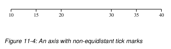
The valueSteps property lets you explicitly specify the
tick mark locations, so you don't have to follow regular intervals.
Hence, you can plot month ends and month end dates with a couple of
helper functions, and without needing special time series chart
classes.
The following code show how to create a simple XValueAxis with special
tick intervals. Make sure to set the valueSteps attribute before calling
the configure method!
from reportlab.graphics.shapes import Drawing
from reportlab.graphics.charts.axes import XValueAxis

drawing = Drawing(400, 100)

data = [(10, 20, 30, 40)]

xAxis = XValueAxis()
xAxis.setPosition(75, 50, 300)
xAxis.valueSteps = [10, 15, 20, 30, 35, 40]
xAxis.configure(data)
xAxis.labels.boxAnchor = 'n'

drawing.add(xAxis)
In addition to these properties, all axes classes have three
properties describing how to join two of them to each other.
Again, this is interesting only if you define your own charts
or want to modify the appearance of an existing chart using
such axes.
These properties are listed here only very briefly for now,
but you can find a host of sample functions in the module
reportlab/graphics/axes.py which you can examine...
One axis is joined to another, by calling the method
joinToAxis(otherAxis, mode, pos) on the first axis,
with mode and pos being the properties described by
joinAxisMode and joinAxisPos, respectively.
'points' means to use an absolute value, and 'value'
to use a relative value (both indicated by the the
joinAxisPos property) along the axis.
| Property | Meaning |
|---|---|
| joinAxis | Join both axes if true. |
| joinAxisMode | Mode used for connecting axis ('bottom', 'top', 'left', 'right', 'value', 'points', None). |
| joinAxisPos | Position at which to join with other axis. |
Bar Charts
This describes our current VerticalBarChart class, which uses the
axes and labels above.
We think it is step in the right direction but is is
far from final.
Note that people we speak to are divided about 50/50 on whether to
call this a 'Vertical' or 'Horizontal' bar chart.
We chose this name because 'Vertical' appears next to 'Bar', so
we take it to mean that the bars rather than the category axis
are vertical.
As usual, we will start with an example:
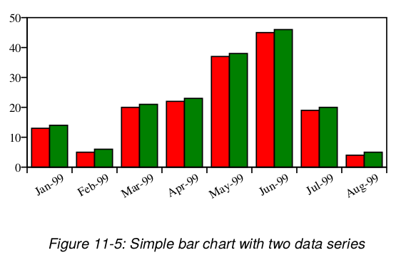
# code to produce the above chart

from reportlab.graphics.shapes import Drawing
from reportlab.graphics.charts.barcharts import VerticalBarChart
from reportlab.lib import colors

drawing = Drawing(400, 200)

data = [
    (13, 5, 20, 22, 37, 45, 19, 4),
    (14, 6, 21, 23, 38, 46, 20, 5)
    ]

bc = VerticalBarChart()
bc.x = 50
bc.y = 50
bc.height = 125
bc.width = 300
bc.data = data
bc.strokeColor = colors.black

bc.valueAxis.valueMin = 0
bc.valueAxis.valueMax = 50
bc.valueAxis.valueStep = 10

bc.categoryAxis.labels.boxAnchor = 'ne'
bc.categoryAxis.labels.dx = 8
bc.categoryAxis.labels.dy = -2
bc.categoryAxis.labels.angle = 30
bc.categoryAxis.categoryNames = ['Jan-99','Feb-99','Mar-99',
   'Apr-99','May-99','Jun-99','Jul-99','Aug-99']

drawing.add(bc)
Most of this code is concerned with setting up the axes and
labels, which we have already covered.
Here are the top-level properties of the VerticalBarChart class:
| Property | Meaning |
|---|---|
| data | This should be a list of lists of numbers or list of tuples of numbers. If you have just one series, write it as data = [(10,20,30,42),] |
| x, y, width, height | These define the inner 'plot rectangle'. We highlighted this with a yellow border above. Note that it is your job to place the chart on the drawing in a way which leaves room for all the axis labels and tickmarks. We specify this 'inner rectangle' because it makes it very easy to lay out multiple charts in a consistent manner. |
| strokeColor | Defaults to None. This will draw a border around the plot rectangle, which may be useful in debugging. Axes will overwrite this. |
| fillColor | Defaults to None. This will fill the plot rectangle with a solid color. (Note that we could implement dashArray etc. as for any other solid shape) |
| valueAxis | The value axis, which may be formatted as described previously. |
| categoryAxis | The category axis, which may be formatted as described previously. |
| title | Not Implemented Yet. This needs to be like a label, but also lets you set the text directly. It would have a default location below the axis. |
| useAbsolute | Defaults to 0. If 1, the three properties below are absolute values in points (which means you can make a chart where the bars stick out from the plot rectangle); if 0, they are relative quantities and indicate the proportional widths of the elements involved. |
| groupSpacing | Defaults to 5. This is the space between each group of bars. If you have only one series, use groupSpacing and not barSpacing to split them up. Half of the groupSpacing is used before the first bar in the chart, and another half at the end. |
| barWidth | As it says. Defaults to 10. |
| barSpacing | Defaults to 0. This is the spacing between bars in each group. If you wanted a little gap between green and red bars in the example above, you would make this non-zero. |
| barLabels | A collection of labels used to format all bar labels. Since this is a two-dimensional array, you may explicitly format the third label of the second series using this syntax: chart.barLabels[(1,2)].fontSize = 12 |
| barLabelFormat | Defaults to None. As with the YValueAxis, if you supply a function or format string then labels will be drawn next to each bar showing the numeric value. They are positioned automatically above the bar for positive values and below for negative ones. |
| barLabelArray | Explicit array of bar label values, must match size of data if present. They should also be strings. These labels values will be displayed only if the property barLabelFormat above is set to 'values'. |
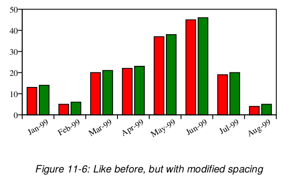
From this table we deduce that adding the following lines to our code
above should double the spacing between bar groups (the groupSpacing
attribute has a default value of five points) and we should also see
some tiny space between bars of the same group (barSpacing).
    bc.groupSpacing = 10
    bc.barSpacing = 2.5
And, in fact, this is exactly what we can see after adding these lines to the code above. Notice how the width of the individual bars has changed as well. This is because the space added between the bars has to be 'taken' from somewhere as the total chart width stays unchanged.
Bars labels are automatically displayed for negative values below the lower end of the bar for positive values above the upper end of the other ones.
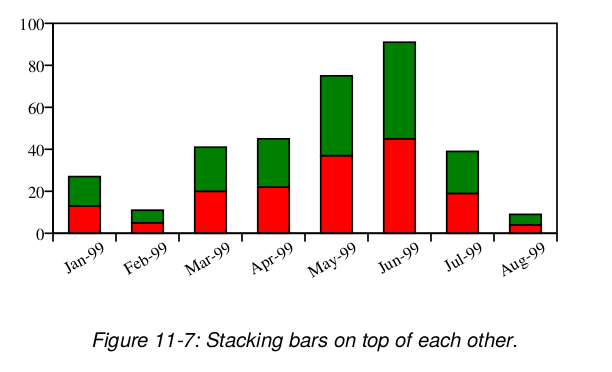
Stacked bars are also supported for vertical bar graphs.
You enable this layout for your chart by setting the style
attribute to 'stacked' on the categoryAxis.
bc.categoryAxis.style = 'stacked'
Here is an example of the previous chart values arranged in the stacked style.
Line Charts
We consider "Line Charts" to be essentially the same as "Bar Charts", but with lines instead of bars. Both share the same pair of Category/Value axes pairs. This is in contrast to "Line Plots", where both axes are Value axes.
The following code and its output shall serve as a simple
example.
More explanation will follow.
For the time being you can also study the output of running
the tool reportlab/lib/graphdocpy.py withough any arguments
and search the generated PDF document for examples of
Line Charts.
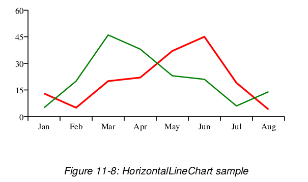
from reportlab.graphics.charts.linecharts import HorizontalLineChart
from reportlab.graphics.shapes import Drawing

drawing = Drawing(400, 200)

data = [
    (13, 5, 20, 22, 37, 45, 19, 4),
    (5, 20, 46, 38, 23, 21, 6, 14)
]

lc = HorizontalLineChart()
lc.x = 50
lc.y = 50
lc.height = 125
lc.width = 300
lc.data = data
lc.joinedLines = 1
catNames = 'Jan Feb Mar Apr May Jun Jul Aug'.split(' ')
lc.categoryAxis.categoryNames = catNames
lc.categoryAxis.labels.boxAnchor = 'n'
lc.valueAxis.valueMin = 0
lc.valueAxis.valueMax = 60
lc.valueAxis.valueStep = 15
lc.lines[0].strokeWidth = 2
lc.lines[1].strokeWidth = 1.5
drawing.add(lc)
| Property | Meaning |
|---|---|
| data | Data to be plotted, list of (lists of) numbers. |
| x, y, width, height | Bounding box of the line chart. Note that x and y do NOT specify the centre but the bottom left corner |
| valueAxis | The value axis, which may be formatted as described previously. |
| categoryAxis | The category axis, which may be formatted as described previously. |
| strokeColor | Defaults to None. This will draw a border around the plot rectangle, which may be useful in debugging. Axes will overwrite this. |
| fillColor | Defaults to None. This will fill the plot rectangle with a solid color. |
| lines.strokeColor | Color of the line. |
| lines.strokeWidth | Width of the line. |
| lineLabels | A collection of labels used to format all line labels. Since this is a two-dimensional array, you may explicitly format the third label of the second line using this syntax: chart.lineLabels[(1,2)].fontSize = 12 |
| lineLabelFormat | Defaults to None. As with the YValueAxis, if you supply a function or format string then labels will be drawn next to each line showing the numeric value. You can also set it to 'values' to display the values explicity defined in lineLabelArray. |
| lineLabelArray | Explicit array of line label values, must match size of data if present. These labels values will be displayed only if the property lineLabelFormat above is set to 'values'. |
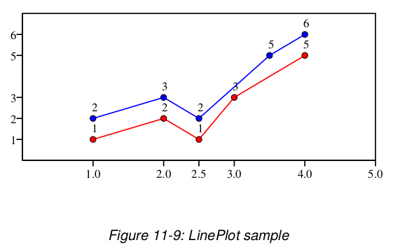
Line Plots
Below we show a more complex example of a Line Plot that also uses some experimental features like line markers placed at each data point.
from reportlab.graphics.charts.lineplots import LinePlot
from reportlab.graphics.widgets.markers import makeMarker
from reportlab.graphics.shapes import Drawing
from reportlab.lib import colors

drawing = Drawing(400, 200)

data = [
    ((1,1), (2,2), (2.5,1), (3,3), (4,5)),
    ((1,2), (2,3), (2.5,2), (3.5,5), (4,6))
]

lp = LinePlot()
lp.x = 50
lp.y = 50
lp.height = 125
lp.width = 300
lp.data = data
lp.joinedLines = 1
lp.lines[0].symbol = makeMarker('FilledCircle')
lp.lines[1].symbol = makeMarker('Circle')
lp.lineLabelFormat = '%2.0f'
lp.strokeColor = colors.black
lp.xValueAxis.valueMin = 0
lp.xValueAxis.valueMax = 5
lp.xValueAxis.valueSteps = [1, 2, 2.5, 3, 4, 5]
lp.xValueAxis.labelTextFormat = '%2.1f'
lp.yValueAxis.valueMin = 0
lp.yValueAxis.valueMax = 7
lp.yValueAxis.valueSteps = [1, 2, 3, 5, 6]

drawing.add(lp)
| Property | Meaning |
|---|---|
| data | Data to be plotted, list of (lists of) numbers. |
| x, y, width, height | Bounding box of the line chart. Note that x and y do NOT specify the centre but the bottom left corner |
| xValueAxis | The vertical value axis, which may be formatted as described previously. |
| yValueAxis | The horizontal value axis, which may be formatted as described previously. |
| strokeColor | Defaults to None. This will draw a border around the plot rectangle, which may be useful in debugging. Axes will overwrite this. |
| strokeWidth | Defaults to None. Width of the border around the plot rectangle. |
| fillColor | Defaults to None. This will fill the plot rectangle with a solid color. |
| lines.strokeColor | Color of the line. |
| lines.strokeWidth | Width of the line. |
| lines.symbol | Marker used for each point. You can create a new marker using the function makeMarker(). For example to use a circle, the function call would be makeMarker('Circle') |
| lineLabels | A collection of labels used to format all line labels. Since this is a two-dimensional array, you may explicitly format the third label of the second line using this syntax: chart.lineLabels[(1,2)].fontSize = 12 |
| lineLabelFormat | Defaults to None. As with the YValueAxis, if you supply a function or format string then labels will be drawn next to each line showing the numeric value. You can also set it to 'values' to display the values explicity defined in lineLabelArray. |
| lineLabelArray | Explicit array of line label values, must match size of data if present. These labels values will be displayed only if the property lineLabelFormat above is set to 'values'. |
Pie Charts
As usual, we will start with an example:
from reportlab.graphics.charts.piecharts import Pie
from reportlab.graphics.shapes import Drawing
from reportlab.lib import colors

d = Drawing(200, 100)

pc = Pie()
pc.x = 65
pc.y = 15
pc.width = 70
pc.height = 70
pc.data = [10,20,30,40,50,60]
pc.labels = ['a','b','c','d','e','f']

pc.slices.strokeWidth=0.5
pc.slices[3].popout = 10
pc.slices[3].strokeWidth = 2
pc.slices[3].strokeDashArray = [2,2]
pc.slices[3].labelRadius = 1.75
pc.slices[3].fontColor = colors.red
d.add(pc)
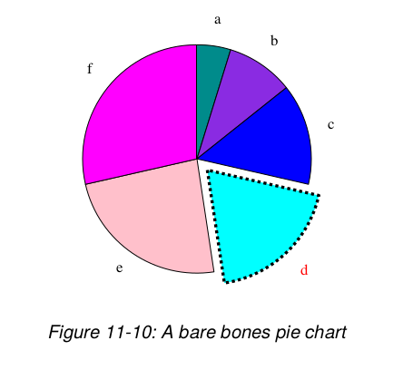
Properties are covered below. The pie has a 'slices' collection and we document wedge properties in the same table.
| Property | Meaning |
|---|---|
| data | A list or tuple of numbers |
| x, y, width, height | Bounding box of the pie. Note that x and y do NOT specify the centre but the bottom left corner, and that width and height do not have to be equal; pies may be elliptical and slices will be drawn correctly. |
| labels | None, or a list of strings. Make it None if you don't want labels around the edge of the pie. Since it is impossible to know the size of slices, we generally discourage placing labels in or around pies; it is much better to put them in a legend alongside. |
| startAngle | Where is the start angle of the first pie slice? The default is '90' which is twelve o'clock. |
| direction | Which direction do slices progress in? The default is 'clockwise'. |
| sideLabels | This creates a chart with the labels in two columns, one on either side. |
| sideLabelsOffset | This is a fraction of the width of the pie that defines the horizontal distance between the pie and the columns of labels. |
| simpleLabels | Default is 1. Set to 0 to enable the use of customizable labels and of properties prefixed by label_ in the collection slices. |
| slices | Collection of slices. This lets you customise each wedge, or individual ones. See below |
| slices.strokeWidth | Border width for wedge |
| slices.strokeColor | Border color |
| slices.strokeDashArray | Solid or dashed line configuration |
| slices.popout | How far out should the slice(s) stick from the centre of the pie? Default is zero. |
| slices.fontName | Name of the label font |
| slices.fontSize | Size of the label font |
| slices.fontColor | Color of the label text |
| slices.labelRadius | This controls the anchor point for a text label. It is a fraction of the radius; 0.7 will place the text inside the pie, 1.2 will place it slightly outside. (note that if we add labels, we will keep this to specify their anchor point) |
Customizing Labels
Each slide label can be customized individually by changing
the properties prefixed by label_ in the collection slices.
For example pc.slices[2].label_angle = 10 changes the angle
of the third label.
Before being able to use these customization properties, you need
to disable simple labels with: pc.simplesLabels = 0
| Property | Meaning |
|---|---|
| label_dx | X Offset of the label |
| label_dy | Y Offset of the label |
| label_angle | Angle of the label, default (0) is horizontal, 90 is vertical, 180 is upside down |
| label_boxAnchor | Anchoring point of the label |
| label_boxStrokeColor | Border color for the label box |
| label_boxStrokeWidth | Border width for the label box |
| label_boxFillColor | Filling color of the label box |
| label_strokeColor | Border color for the label text |
| label_strokeWidth | Border width for the label text |
| label_text | Text of the label |
| label_width | Width of the label |
| label_maxWidth | Maximum width the label can grow to |
| label_height | Height of the label |
| label_textAnchor | Maximum height the label can grow to |
| label_visible | True if the label is to be drawn |
| label_topPadding | Padding at top of box |
| label_leftPadding | Padding at left of box |
| label_rightPadding | Padding at right of box |
| label_bottomPadding | Padding at bottom of box |
| label_simple_pointer | Set to 1 for simple pointers |
| label_pointer_strokeColor | Color of indicator line |
| label_pointer_strokeWidth | Width of indicator line] |
Side Labels
If the sideLabels attribute is set to true, then the labels of the slices are placed in two columns, one on either side of the pie and the start angle of the pie will be set automatically. The anchor of the right hand column is set to 'start' and the anchor of the left hand column is set to 'end'. The distance from the edge of the pie from the edge of either column is decided by the sideLabelsOffset attribute, which is a fraction of the width of the pie. If xradius is changed, the pie can overlap the labels, and so we advise leaving xradius as None. There is an example below.
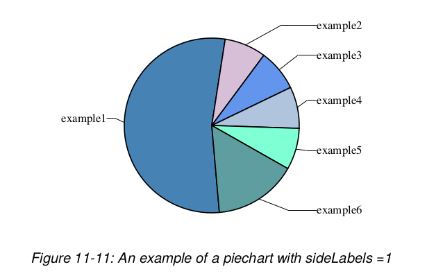
If you have sideLabels set to True, then some of the attributes become redundant, such as pointerLabelMode. Also sideLabelsOffset only changes the piechart if sideLabels is set to true.
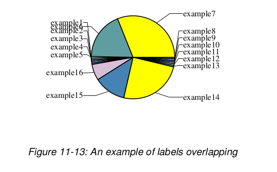
Some issues
The pointers can cross if there are too many slices.
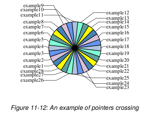
Also the labels can overlap despite checkLabelOverlap if they correspond to slices that are not adjacent.
Legends
Various preliminary legend classes can be found but need a
cleanup to be consistent with the rest of the charting
model.
Legends are the natural place to specify the colors and line
styles of charts; we propose that each chart is created with
a legend attribute which is invisible.
One would then do the following to specify colors:
myChart.legend.defaultColors = [red, green, blue]
One could also define a group of charts sharing the same legend:
myLegend = Legend()
myLegend.defaultColor = [red, green.....] #yuck!
myLegend.columns = 2
# etc.
chart1.legend = myLegend
chart2.legend = myLegend
chart3.legend = myLegend
Remaining Issues
There are several issues that are almost solved, but for which is is a bit too early to start making them really public. Nevertheless, here is a list of things that are under way:
-
Color specification - right now the chart has an undocumented property
defaultColors, which provides a list of colors to cycle through, such that each data series gets its own color. Right now, if you introduce a legend, you need to make sure it shares the same list of colors. Most likely, this will be replaced with a scheme to specify a kind of legend containing attributes with different values for each data series. This legend can then also be shared by several charts, but need not be visible itself. -
Additional chart types - when the current design will have become more stable, we expect to add variants of bar charts to deal with percentile bars as well as the side-by-side variant seen here.
Outlook
It will take some time to deal with the full range of chart types. We expect to finalize bars and pies first and to produce trial implementations of more general plots, thereafter.
X-Y Plots
Most other plots involve two value axes and directly plotting
x-y data in some form.
The series can be plotted as lines, marker symbols, both, or
custom graphics such as open-high-low-close graphics.
All share the concepts of scaling and axis/title formatting.
At a certain point, a routine will loop over the data series and
'do something' with the data points at given x-y locations.
Given a basic line plot, it should be very easy to derive a
custom chart type just by overriding a single method - say,
drawSeries().
Marker customisation and custom shapes
Well known plotting packages such as excel, Mathematica and Excel offer ranges of marker types to add to charts. We can do better - you can write any kind of chart widget you want and just tell the chart to use it as an example.
Combination plots
Combining multiple plot types is really easy. You can just draw several charts (bar, line or whatever) in the same rectangle, suppressing axes as needed. So a chart could correlate a line with Scottish typhoid cases over a 15 year period on the left axis with a set of bars showing inflation rates on the right axis. If anyone can remind us where this example came from we'll attribute it, and happily show the well-known graph as an example.
Interactive editors
One principle of the Graphics package is to make all 'interesting' properties of its graphic components accessible and changeable by setting apropriate values of corresponding public attributes. This makes it very tempting to build a tool like a GUI editor that that helps you with doing that interactively.
ReportLab has built such a tool using the Tkinter toolkit that loads pure Python code describing a drawing and records your property editing operations. This "change history" is then used to create code for a subclass of that chart, say, that can be saved and used instantly just like any other chart or as a new starting point for another interactive editing session.
This is still work in progress, though, and the conditions for releasing this need to be further elaborated.
Misc.
This has not been an exhaustive look at all the chart classes.
Those classes are constantly being worked on.
To see exactly what is in the current distribution, use the
graphdocpy.py utility.
By default, it will run on reportlab/graphics, and produce a full
report.
(If you want to run it on other modules or packages,
graphdocpy.py -h prints a help message that will tell you
how.)
This is the tool that was mentioned in the section on 'Documenting Widgets'.
Shapes
This section describes the concept of shapes and their importance as building blocks for all output generated by the graphics library. Some properties of existing shapes and their relationship to diagrams are presented and the notion of having different renderers for different output formats is briefly introduced.
Available Shapes
Drawings are made up of Shapes.
Absolutely anything can be built up by combining the same set of
primitive shapes.
The module shapes.py supplies a number of primitive shapes and
constructs which can be added to a drawing.
They are:
- Rect
- Circle
- Ellipse
- Wedge (a pie slice)
- Polygon
- Line
- PolyLine
- String
- Group
- Path (not implemented yet, but will be added in the future)
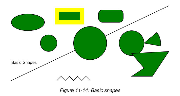
The following drawing, taken from our test suite, shows most of the
basic shapes (except for groups).
Those with a filled green surface are also called solid shapes
(these are Rect, Circle, Ellipse, Wedge and Polygon).
Shape Properties
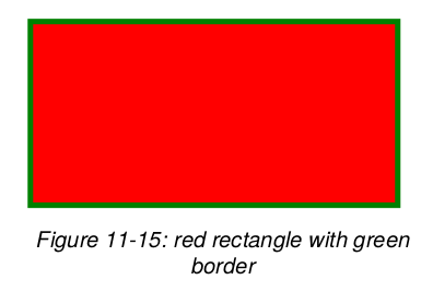
Shapes have two kinds of properties - some to define their geometry and some to define their style. Let's create a red rectangle with 3-point thick green borders:
>>> from reportlab.graphics.shapes import Rect
>>> from reportlab.lib.colors import red, green
>>> r = Rect(5, 5, 200, 100)
>>> r.fillColor = red
>>> r.strokeColor = green
>>> r.strokeWidth = 3
>>>
Note: In future examples we will omit the import statements.
All shapes have a number of properties which can be set. At an interactive prompt, we can use their dumpProperties() method to list these. Here's what you can use to configure a Rect:
>>> r.dumpProperties()
fillColor = Color(1.00,0.00,0.00)
height = 100
rx = 0
ry = 0
strokeColor = Color(0.00,0.50,0.00)
strokeDashArray = None
strokeLineCap = 0
strokeLineJoin = 0
strokeMiterLimit = 0
strokeWidth = 3
width = 200
x = 5
y = 5
>>>
Shapes generally have style properties and geometry
properties.
x, y, width and height are part of the geometry and must
be provided when creating the rectangle, since it does not make
much sense without those properties.
The others are optional and come with sensible defaults.
You may set other properties on subsequent lines, or by passing them as optional arguments to the constructor. We could also have created our rectangle this way:
>>> r = Rect(5, 5, 200, 100,
     fillColor=red,
     strokeColor=green,
     strokeWidth=3)
Let's run through the style properties. fillColor is obvious.
stroke is publishing terminology for the edge of a shape;
the stroke has a color, width, possibly a dash pattern, and
some (rarely used) features for what happens when a line turns
a corner.
rx and ry are optional geometric properties and are used to
define the corner radius for a rounded rectangle.
All the other solid shapes share the same style properties.
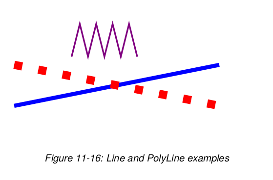
Lines
We provide single straight lines, PolyLines and curves.
Lines have all the stroke* properties, but no fillColor.
Here are a few Line and PolyLine examples and the corresponding
graphics output:
Line(50,50, 300,100,
 strokeColor=colors.blue, strokeWidth=5)
Line(50,100, 300,50,
 strokeColor=colors.red,
 strokeWidth=10,
 strokeDashArray=[10, 20])
PolyLine([120,110, 130,150, 140,110, 150,150, 160,110, 170,150, 180,110, 190,150, 200,110], strokeWidth=2, strokeColor=colors.purple)
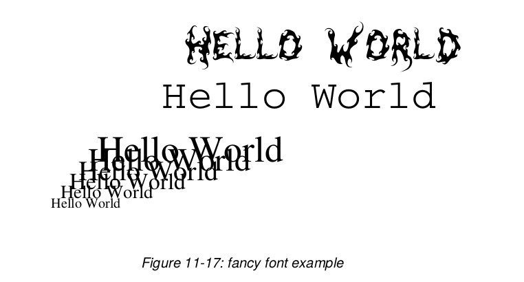
Strings
The ReportLab Graphics package is not designed for fancy text
layout, but it can place strings at desired locations and with
left/right/center alignment.
Let's specify a String object and look at its properties:
>>> s = String(10, 50, 'Hello World')
>>> s.dumpProperties()
fillColor = Color(0.00,0.00,0.00)
fontName = Times-Roman
fontSize = 10
text = Hello World
textAnchor = start
x = 10
y = 50
>>>
Strings have a textAnchor property, which may have one of the values 'start', 'middle', 'end'. If this is set to 'start', x and y relate to the start of the string, and so on. This provides an easy way to align text.
Strings use a common font standard: the Type 1 Postscript fonts present in Acrobat Reader. We can thus use the basic 14 fonts in ReportLab and get accurate metrics for them. We have recently also added support for extra Type 1 fonts and the renderers all know how to render Type 1 fonts.
Here is a more fancy example using the code snippet below. Please consult the ReportLab User Guide to see how non-standard like 'DarkGardenMK' fonts are being registered!
from reportlab.graphics.shapes import Drawing, String
d = Drawing(400, 200)
for size in range(12, 36, 4):
    d.add(String(10+size*2, 10+size*2, 'Hello World', fontName='Times-Roman', fontSize=size))

    d.add(String(130, 120, 'Hello World', fontName='Courier', fontSize=36))

    d.add(String(150, 160, 'Hello World', fontName='DarkGardenMK', fontSize=36))
Paths
Postscript paths are a widely understood concept in graphics.
They are not implemented in reportlab/graphics as yet, but they
will be, soon.
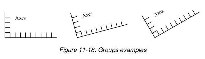
Groups
Finally, we have Group objects. A group has a list of contents, which are other nodes. It can also apply a transformation - its contents can be rotated, scaled or shifted. If you know the math, you can set the transform directly. Otherwise it provides methods to rotate, scale and so on. Here we make a group which is rotated and translated:
>>> g =Group(shape1, shape2, shape3)
>>> g.rotate(30)
>>> g.translate(50, 200)
Groups provide a tool for reuse. You can make a bunch of shapes to represent some component - say, a coordinate system - and put them in one group called "Axis". You can then put that group into other groups, each with a different translation and rotation, and you get a bunch of axis. It is still the same group, being drawn in different places.
Let's do this with some only slightly more code:
    d = Drawing(400, 200)

    Axis = Group(
        Line(0,0,100,0),  # x axis
        Line(0,0,0,50),   # y axis
        Line(0,10,10,10), # ticks on y axis
        Line(0,20,10,20),
        Line(0,30,10,30),
        Line(0,40,10,40),
        Line(10,0,10,10), # ticks on x axis
        Line(20,0,20,10),
        Line(30,0,30,10),
        Line(40,0,40,10),
        Line(50,0,50,10),
        Line(60,0,60,10),
        Line(70,0,70,10),
        Line(80,0,80,10),
        Line(90,0,90,10),
        String(20, 35, 'Axes', fill=colors.black)
        )

    firstAxisGroup = Group(Axis)
    firstAxisGroup.translate(10,10)
    d.add(firstAxisGroup)

    secondAxisGroup = Group(Axis)
    secondAxisGroup.translate(150,10)
    secondAxisGroup.rotate(15)

    d.add(secondAxisGroup)

    thirdAxisGroup = Group(Axis, transform=mmult(translate(300,10), rotate(30)))
    d.add(thirdAxisGroup)
Widgets
We now describe widgets and how they relate to shapes. Using many examples it is shown how widgets make reusable graphics components.
Shapes vs. Widgets
Up until now, Drawings have been 'pure data'. There is no code in them to actually do anything, except assist the programmer in checking and inspecting the drawing. In fact, that's the cornerstone of the whole concept and is what lets us achieve portability - a renderer only needs to implement the primitive shapes.
We want to build reusable graphic objects, including a powerful chart library. To do this we need to reuse more tangible things than rectangles and circles. We should be able to write objects for other to reuse - arrows, gears, text boxes, UML diagram nodes, even fully fledged charts.
The Widget standard is a standard built on top of the shapes module.
Anyone can write new widgets, and we can build up libraries of them.
Widgets support the getProperties() and setProperties() methods,
so you can inspect and modify as well as document them in a uniform
way.
- A widget is a reusable shape
-it can be initialized with no arguments
when its
draw()method is called it creates a primitive Shape or a Group to represent itself - It can have any parameters you want, and they can drive the way it is drawn
- it has a
demo()method which should return an attractively drawn example of itself in a 200x100 rectangle. This is the cornerstone of the automatic documentation tools. Thedemo()method should also have a well written docstring, since that is printed too!
Widgets run contrary to the idea that a drawing is just a bundle of shapes; surely they have their own code? The way they work is that a widget can convert itself to a group of primitive shapes. If some of its components are themselves widgets, they will get converted too. This happens automatically during rendering; the renderer will not see your chart widget, but just a collection of rectangles, lines and strings. You can also explicitly 'flatten out' a drawing, causing all widgets to be converted to primitives.
Using a Widget
Let's imagine a simple new widget. We will use a widget to draw a face, then show how it was implemented.
>>> from reportlab.lib import colors
>>> from reportlab.graphics import shapes
>>> from reportlab.graphics import widgetbase
>>> from reportlab.graphics import renderPDF
>>> d = shapes.Drawing(200, 100)
>>> f = widgetbase.Face()
>>> f.skinColor = colors.yellow
>>> f.mood = "sad"
>>> d.add(f)
>>> renderPDF.drawToFile(d, 'face.pdf', 'A Face')
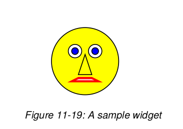
Let's see what properties it has available, using the setProperties()
method we have seen earlier:
    >>> f.dumpProperties()
    eyeColor = Color(0.00,0.00,1.00)
    mood = sad
    size = 80
    skinColor = Color(1.00,1.00,0.00)
    x = 10
    y = 10
    >>>
One thing which seems strange about the above code is that we did not
set the size or position when we made the face.
This is a necessary trade-off to allow a uniform interface for
constructing widgets and documenting them - they cannot require
arguments in their __init__() method.
Instead, they are generally designed to fit in a 200 x 100
window, and you move or resize them by setting properties such as
x, y, width and so on after creation.
In addition, a widget always provides a demo() method.
Simple ones like this always do something sensible before setting
properties, but more complex ones like a chart would not have any
data to plot.
The documentation tool calls demo() so that your fancy new chart
class can create a drawing showing what it can do.
Here are a handful of simple widgets available in the module signsandsymbols.py:
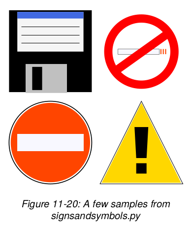
And this is the code needed to generate them as seen in the drawing above:
from reportlab.graphics.shapes import Drawing
from reportlab.graphics.widgets import signsandsymbols

d = Drawing(230, 230)

ne = signsandsymbols.NoEntry()
ds = signsandsymbols.DangerSign()
fd = signsandsymbols.FloppyDisk()
ns = signsandsymbols.NoSmoking()

ne.x, ne.y = 10, 10
ds.x, ds.y = 120, 10
fd.x, fd.y = 10, 120
ns.x, ns.y = 120, 120

d.add(ne)
d.add(ds)
d.add(fd)
d.add(ns)
Compound Widgets
Let's imagine a compound widget which draws two faces side by side. This is easy to build when you have the Face widget.
    >>> tf = widgetbase.TwoFaces()
    >>> tf.faceOne.mood
    'happy'
    >>> tf.faceTwo.mood
    'sad'
    >>> tf.dumpProperties()
    faceOne.eyeColor = Color(0.00,0.00,1.00)
    faceOne.mood = happy
    faceOne.size = 80
    faceOne.skinColor = None
    faceOne.x = 10
    faceOne.y = 10
    faceTwo.eyeColor = Color(0.00,0.00,1.00)
    faceTwo.mood = sad
    faceTwo.size = 80
    faceTwo.skinColor = None
    faceTwo.x = 100
    faceTwo.y = 10
    >>>
The attributes 'faceOne' and 'faceTwo' are deliberately exposed so you can get at them directly. There could also be top-level attributes, but there aren't in this case.
Verifying Widgets
The widget designer decides the policy on verification, but by default they work like shapes - checking every assignment - if the designer has provided the checking information.
Implementing Widgets
We tried to make it as easy to implement widgets as possible. Here's the code for a Face widget which does not do any type checking:
class Face(Widget):
    \"\"\"This draws a face with two eyes, mouth and nose.\"\"\"

    def __init__(self):
        self.x = 10
        self.y = 10
        self.size = 80
        self.skinColor = None
        self.eyeColor = colors.blue
        self.mood = 'happy'

    def draw(self):
        s = self.size  # abbreviate as we will use this a lot
        g = shapes.Group()
        g.transform = [1,0,0,1,self.x, self.y]
        # background
        g.add(shapes.Circle(s * 0.5, s * 0.5, s * 0.5,
                            fillColor=self.skinColor))
        # CODE OMITTED TO MAKE MORE SHAPES
        return g
We left out all the code to draw the shapes in this document, but you
can find it in the distribution in widgetbase.py.
By default, any attribute without a leading underscore is returned by setProperties. This is a deliberate policy to encourage consistent coding conventions.
Once your widget works, you probably want to add support for
verification. This involves adding a dictionary to the class called
_verifyMap, which map from attribute names to 'checking functions'.
The widgetbase.py module defines a bunch of checking functions with names
like isNumber, isListOfShapes and so on. You can also simply use None,
which means that the attribute must be present but can have any type.
And you can and should write your own checking functions. We want to
restrict the "mood" custom attribute to the values "happy", "sad" or
"ok". So we do this:
class Face(Widget):
    \"\"\"This draws a face with two eyes.  It exposes a
    couple of properties to configure itself and hides
    all other details\"\"\"
    def checkMood(moodName):
        return (moodName in ('happy','sad','ok'))
    _verifyMap = {
        'x': shapes.isNumber,
        'y': shapes.isNumber,
        'size': shapes.isNumber,
        'skinColor':shapes.isColorOrNone,
        'eyeColor': shapes.isColorOrNone,
        'mood': checkMood
        }
This checking will be performed on every attribute assignment; or, if
config.shapeChecking is off, whenever you call myFace.verify().
Documenting Widgets
We are working on a generic tool to document any Python package or module; this is already checked into ReportLab and will be used to generate a reference for the ReportLab package. When it encounters widgets, it adds extra sections to the manual including:
- the doc string for your widget class
- the code snippet from your demo() method, so people can see how to use it
- the drawing produced by the demo() method
- the property dump for the widget in the drawing.
This tool will mean that we can have guaranteed up-to-date documentation on our widgets and charts, both on the web site and in print; and that you can do the same for your own widgets, too!
Widget Design Strategies
We could not come up with a consistent architecture for designing
widgets, so we are leaving that problem to the authors! If you do not
like the default verification strategy, or the way
setProperties/getProperties works, you can override them yourself.
For simple widgets it is recommended that you do what we did above:
select non-overlapping properties, initialize every property on
__init__ and construct everything when draw() is called. You can
instead have __setattr__ hooks and have things updated when certain
attributes are set. Consider a pie chart. If you want to expose the
individual slices, you might write code like this:
    from reportlab.graphics.charts import piecharts
    pc = piecharts.Pie()
    pc.defaultColors = [navy, blue, skyblue] #used in rotation
    pc.data = [10,30,50,25]
    pc.slices[7].strokeWidth = 5
The last line is problematic as we have only created four slices - in
fact we might not have created them yet. Does pc.slices[7] raise an
error? Is it a prescription for what should happen if a seventh wedge
is defined, used to override the default settings? We dump this
problem squarely on the widget author for now, and recommend that you
get a simple one working before exposing 'child objects' whose
existence depends on other properties' values :-)
We also discussed rules by which parent widgets could pass properties to their children. There seems to be a general desire for a global way to say that 'all slices get their lineWidth from the lineWidth of their parent' without a lot of repetitive coding. We do not have a universal solution, so again leave that to widget authors. We hope people will experiment with push-down, pull-down and pattern-matching approaches and come up with something nice. In the meantime, we certainly can write monolithic chart widgets which work like the ones in, say, Visual Basic and Delphi.
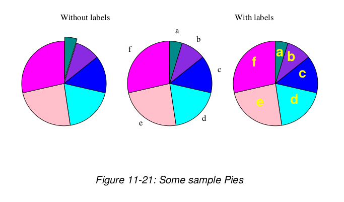
For now have a look at the following sample code using an early version of a pie chart widget and the output it generates:
from reportlab.lib import colors
from reportlab.graphics import shapes,renderPDF
from reportlab.graphics.charts.piecharts import Pie
from reportlab.graphics.shapes import Drawing, String

d = Drawing(400,200)
d.add(String(100,175,"Without labels", textAnchor="middle"))
d.add(String(300,175,"With labels", textAnchor="middle"))

pc = Pie()
pc.x = 25
pc.y = 50
pc.data = [10,20,30,40,50,60]
pc.slices[0].popout = 5
d.add(pc, 'pie1')

pc2 = Pie()
pc2.x = 150
pc2.y = 50
pc2.data = [10,20,30,40,50,60]
pc2.labels = ['a','b','c','d','e','f']
d.add(pc2, 'pie2')

pc3 = Pie()
pc3.x = 275
pc3.y = 50
pc3.data = [10,20,30,40,50,60]
pc3.labels = ['a','b','c','d','e','f']
pc3.slices.labelRadius = 0.65
pc3.slices.fontName = "Helvetica-Bold"
pc3.slices.fontSize = 16
pc3.slices.fontColor = colors.yellow
d.add(pc3, 'pie3')