Fund reports - json to pdf
Register And Install An Evaluation Copy Of Reportlab Plus
This tutorial is aimed at showing the use of Report Markup Language (RML), which is a component of our commercial tool-kit. Here you can get a basic introduction to a common application architecture and start experimenting with some fundamental ReportLab technologies. If you have any problems or questions, please email enquiries@reportlab.com.
This should work with Python 2.7 & >=3.3
All you need to do to download a full evaluation copy is sign in or register on our site; then, follow the installation instructions to get yourself set up. Once these are completed, you're ready to go.
To check that all the dependencies are in place, start Python up (inside your virtual environment, if you are using one) and check these imports all work:
>>> import reportlab
>>> import rlextra
Download And Install Tutorial Pack
You have two options, either download the partial tutorial pack, which means you will need to finish to the code changes listed below or download the completed tutorial pack, which means you will not need to make the changes listed below.
Take a look at the directory structure:
data/
output/
rml/
gen_factsheet.py
data/will hold our JSON datarml/will hold the fonts, images, and templates for constructing the documentsoutput/will hold the generated PDFsgen_factsheet.pywill be the script which ties it all together
Making Your First Document In Report Markup Language
Execute the following command;
`python gen_factsheet.py data/factsheet.json`
You should now see a file output/factsheet.pdf, which should look like:
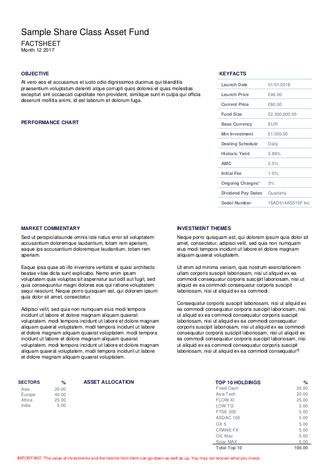
It is not much to look at in its current state, but we will make some improvements along the way.
Code walk through
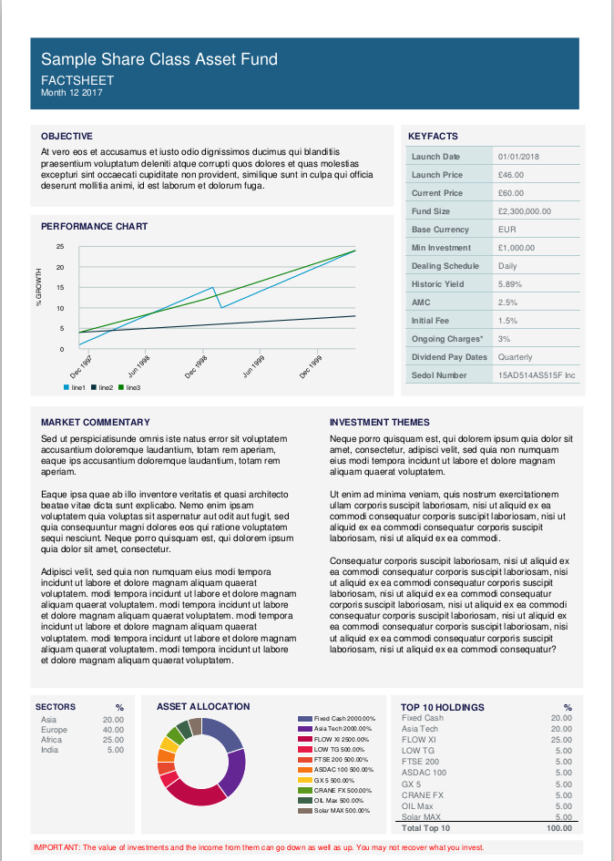
The PDF template is rml/factsheet.prep, open that file in an editor. We define the frame(sections) on the page in the pagetemplate tag. During development, setting showBoundary can help be a visual guide to getting frames in the right place. Change the value from 0 to 1. Now generate the PDF again & you should see the the outline of the frames. Change showBoundary back to 0.
Add colours
Lets add some coloured rectangles to the page. We can add the colours to sit behind the content, to give it some colour. We use the rect tag to draw rectangles on the page & set the colour accordingly. Add the following lines below:
<fill color="color4"/>
<rect x="28" y="735" width="536" height="70" fill="yes" stroke="no"/> <!--background: Page banner -->
<fill color="color6"/>
<rect x="28" y="640" width="355" height="80" fill="yes" stroke="no"/> <!-- background: Objective -->
<rect x="28" y="455" width="355" height="177" fill="yes" stroke="no"/> <!-- background: Performance chart -->
<rect x="390" y="455" width="180" height="265" fill="yes" stroke="no"/> <!-- background: Investment partners -->
<rect x="28" y="170" width="540" height="275" fill="yes" stroke="no"/> <!-- background: Market Commentary -->
<rect x="28" y="27" width="102" height="136"  fill="yes" stroke="no"/> <!-- background: Asset alloc table -->
<rect x="136" y="27" width="240" height="136"  fill="yes" stroke="no"/> <!-- background: Pie chart -->
<rect x="380" y="27" width="188" height="136"  fill="yes" stroke="no"/> <!-- background: Holdings -->
<rect x="28" y="7" width="540" height="14.2"  fill="yes" stroke="no"/> <!-- background: Important info -->
<place x="31" y="7" width="566" height="12">
We can also add colour to the Keyfacts table that appears on the right of the page.
<lineStyle kind="GRID" thickness="0.5" colorName="color7" start="0,0" stop="-1,-1"/>
Now regenerate the PDF.
Adding Charts
We are now going to add two charts to the prep file.
Line Chart
The code for fundindexlineplot.py was generated by our our graphics library.
<drawing module="fundindexlineplot" function="FundIndexLinePlot">
<param name="chart.data">{{data.index_line_plot_data}}</param>
</drawing>
Pie Chart
The code for assets_pie.py was also generated by our our graphics library.
<drawing module="assets_pie" function="AssetPie2dp">
<param name="pie.data">{{ [float(holding.amount) for holding in data.top_holdings}} </param>
<param name="_labels">{{[holding.name for holding in data.top_holdings]}}</param>
</drawing>
Finally, look in data/factsheet.json and change the "status" to "approved":
"status": "approved",
Now save data.json and re-run the script and check the output. It should look like this:
Further examples of the huge range of chart types available with ReportLab can be found in our chart gallery which included details of the main parameters of each style. Go and experiment!