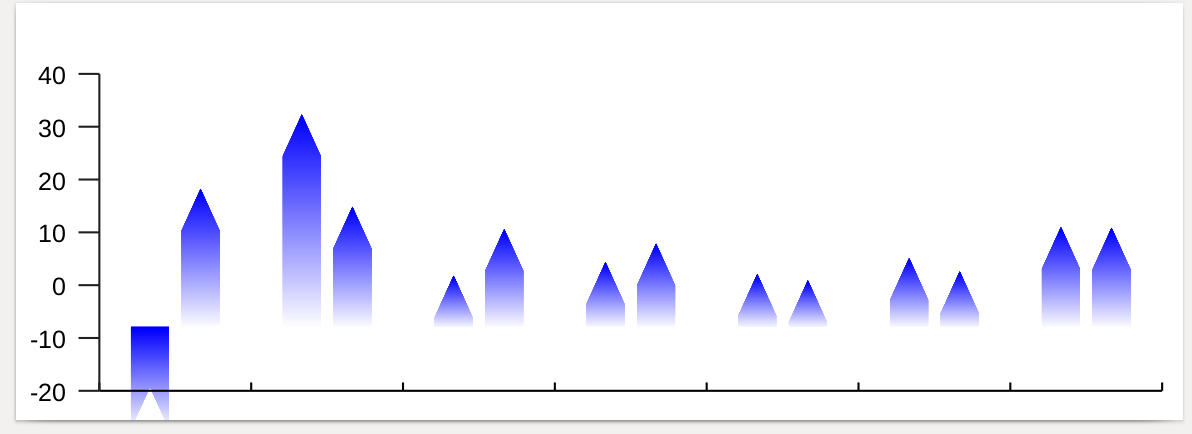
Create a Custom Pointy Bar Chart
The plan is to create a "custom bar" with 90' angle top, and a fade, with the bottom of the bar ending up below the axis
If you need to create a barchart with special properties it's probably easiest to just override the BarChart _makeBar method
Default method from reportlab.graphics.charts.barcharts
 def _makeBar(self,g,x,y,width,height,rowNo,style):
        r = Rect(x, y, width, height)
        r.strokeWidth = style.strokeWidth
        r.fillColor = style.fillColor
        r.strokeColor = style.strokeColor
        if style.strokeDashArray:
            r.strokeDashArray = style.strokeDashArray
        g.add(r)
The default shape for the bar is a Rectangle shape Rect(x,y,width,height) from reportlab.graphics.shapes import Rect,
1) The outline itself given the standard rectangle height and width you have to find the 5 points that correspond. 2) the result is filled with a gradient color. That probably implies you will ahve to use a shaded polygon. Finally 3) you need to decide how to render small values.
Let 10pts be the height of the triangle ontop of the bar.
belowAxisHeight - How many points below the y axis to start the bar shape
A pointy bar chart Polygon has five x,y points
    Y             3*
    |             /\
    |            /  \
    |           /    \
    |          /      \
    |         /        \
    |        2*         4*
    |        |          |
    |        |          |
    |        |          |
    |        |          |
    |        |          |
    |________|__ __ __ _|______________X
             |__________|
            1*          5*
*triangleHeight - Height of the traingle at the top
*y0 - the new y point after subtraction the belowAxisHeight
*ytop - Height of the bar from the axis line
*y1 - is the height of the bar withought the triangle section
            1*       2*           3*                4*           5*
points  = (x,y0), (x,y1), (x+0.5*width, ytop), (x+width,y1), (x+width, y0)
Create a new class PointyBarChart and override the _makeBar method
Use a ShadedPolygon instead of a Rect.
new .py file pentagon.py
from reportlab.graphics.charts.barcharts import VerticalBarChart
from reportlab.graphics.widgets.grids import ShadedPolygon
from reportlab.lib import colors


class PointyBarChart(VerticalBarChart):
    def _makeBar(self,g,x,y,width,height,rowNo,style):
        belowAxisHeight = 10
        triangleHeight = 10
        y0 = y-belowAxisHeight
        ytop = y + height
        y1 = ytop - triangleHeight
        r = ShadedPolygon(points=(x,y0,x,y1,x+0.5*width,ytop,x+width,y1,x+width, y0),fillColorStart=colors.white,fillColorEnd=colors.blue,strokeColor=None,strokeWidth=1,angle=90,numShades=200,cylinderMode=0)
        g.add(r)
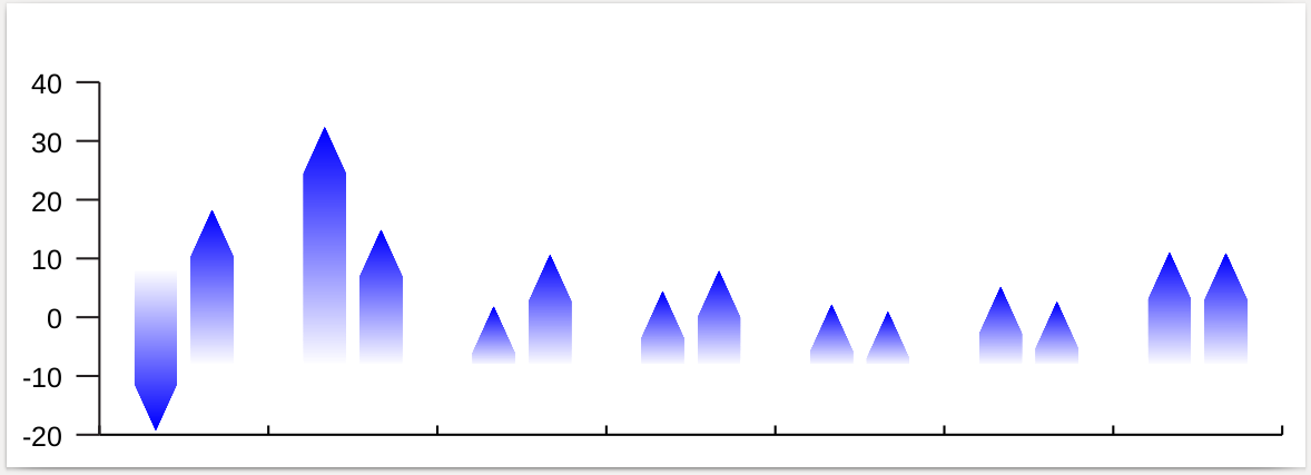
When the bar has a negative number
3 things need to change when the bar height is a negative number
1, belowAxisHeight = 10 if height >= 0 else -10
2, triangleHeight = 10 if height >= 0 else -10
3, ShadedPolygon object - change the angle of the shading for when the bar height is negative
'angle=90 if height >=0 else -90'
class PointyBarChart(VerticalBarChart):
    def _makeBar(self,g,x,y,width,height,rowNo,style):
        belowAxisHeight = 10 if height >= 0 else -10
        triangleHeight = 10 if height >= 0 else -10
        y0 = y-belowAxisHeight
        ytop = y + height
        y1 = ytop - triangleHeight
        r = ShadedPolygon(points=(x,y0,x,y1,x+0.5*width,ytop,x+width,y1,x+width, y0),fillColorStart=colors.white,fillColorEnd=colors.blue,strokeColor=None,strokeWidth=1,angle=90 if height >=0 else -90,numShades=200,cylinderMode=0)
        g.add(r)
Full chart code with the new PointyBarchart code in use
#Autogenerated by ReportLab guiedit do not edit
from reportlab.graphics.charts.barcharts import VerticalBarChart
from reportlab.graphics.shapes import Drawing, _DrawingEditorMixin, String, Line
from reportlab.lib.colors import purple, PCMYKColor, red, Color, CMYKColor, black
from reportlab.graphics.charts.textlabels import Label
from reportlab.lib.validators import Auto
from pentagon import PointyBarChart

class bar(_DrawingEditorMixin,Drawing):
    def __init__(self,width=280,height=100,*args,**kw):
        Drawing.__init__(self,width,height,*args,**kw)
        self._add(self,PointyBarChart(),name='chart',validate=None,desc=None)
        fontName = 'Helvetica'
        self.chart.barSpacing = 3
        self.chart.barWidth = 9
        self.chart.groupSpacing = 15
        self.chart.width = 255
        self.chart.height = 76
        self.chart.x = 20
        self.chart.y = 7
        self.chart.bars.strokeColor = None
        self.chart.bars.strokeWidth = 0
        # colour list can read its colours from the palette
        colorsList = [PCMYKColor(100,60,0,50,alpha=100), PCMYKColor(100,0,90,50,alpha=100)]
        for i, color in enumerate(colorsList): self.chart.bars[i].fillColor = colorsList[i]
        self.chart.categoryAxis.joinAxisMode='bottom'
        self.chart.categoryAxis.labelAxisMode='low'
        self.chart.categoryAxis.labels.angle = 0
        self.chart.categoryAxis.labels.boxAnchor = 'n'
        self.chart.categoryAxis.labels.dy = -4
        self.chart.categoryAxis.labels.fillColor = black
        self.chart.categoryAxis.labels.fontName = fontName
        self.chart.categoryAxis.labels.fontSize = 6
        self.chart.categoryAxis.labels.textAnchor='middle'
        self.chart.categoryAxis.tickShift=0
        self.chart.categoryAxis.visibleTicks = 1
        self.chart.categoryAxis.tickUp = 2
        self.chart.categoryAxis.tickDown               = 0
        self.chart.categoryAxis.visibleAxis = 1
        self.chart.categoryAxis.visibleGrid         = 0
        self.chart.categoryAxis.strokeWidth = .5
        self.chart.valueAxis.labels.fontName = fontName
        self.chart.valueAxis.labels.fontSize = 6
        self.chart.valueAxis.labels.rightPadding   = 3
        self.chart.valueAxis.drawGridLast=1
        self.chart.valueAxis.rangeRound='both'
        self.chart.valueAxis.avoidBoundFrac = None
        self.chart.valueAxis.strokeWidth = .5
        self.chart.valueAxis.strokeColor = PCMYKColor(0,0,0,100)
        self.chart.valueAxis.minimumTickSpacing    = 1
        self.chart.valueAxis.maximumTicks          = 8
        self.chart.valueAxis.forceZero             = 1
        self.chart.valueAxis.visibleGrid = 0
        self.chart.valueAxis.visibleAxis = 1
        series = 'Shell', 'Royal',
        for i, s in enumerate(series): self.chart.bars[i].name = s
        self.chart.data = [[-19.260000000000002, 32.359999999999999, 1.78, 4.3499999999999996, 2.1000000000000001, 5.1200000000000001, 11.0], [18.239999999999998, 14.85, 10.619999999999999, 7.8700000000000001, 0.90000000000000002, 2.5899999999999999, 10.869999999999999]]
        colorsList= (PCMYKColor(100,60,0,50,alpha=100), PCMYKColor(100,0,90,50,alpha=100), PCMYKColor(80,24,69,70,spotName='350c',alpha=100), PCMYKColor(0,0,0,40,alpha=100), PCMYKColor(0,0,0,100,alpha=100))

if __name__=="__main__": #NORUNTESTS
    bar().save(formats=['pdf'],outDir='.',fnRoot=None)
Finally, Get a ReportLabPlus licence here to remove the watermark lines from your documents.